Juny's Bakehouse
About
Year: 2024
Status: Completed, open for treats!
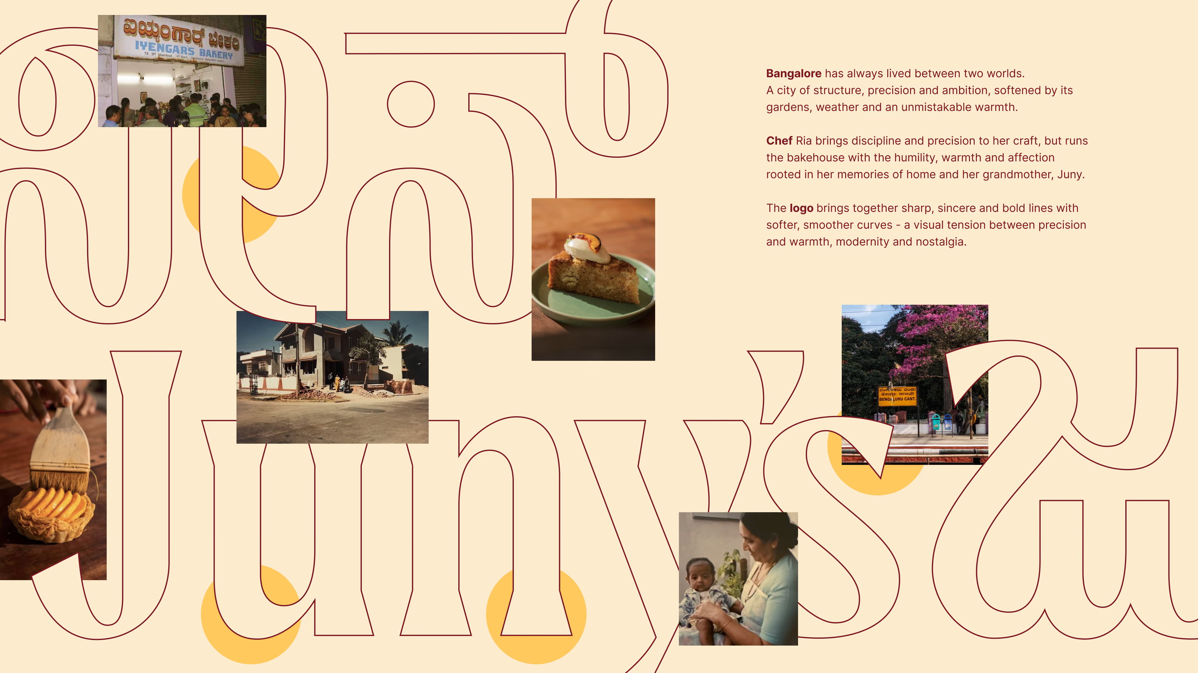
Juny’s isn’t just a café. It’s a home with its doors open again. Once the house Chef Ria Belliappa grew up in, it now welcomes the city as Juny’s Bakehouse—named after her grandmother, and filled with the same warmth it always held.
Here, every corner carries memory. Every scent reminds you of what kitchens used to feel like.It’s more than a place for pastries—it’s a quiet tribute to old Bangalore, kept alive one bake at a time.
Branding: Memory you can hold
The brand identity for Juny’s was built like a family album—warm, expressive, and timeless. Every element evokes the feeling of being welcomed back into a space that’s always been waiting for you.


Logo
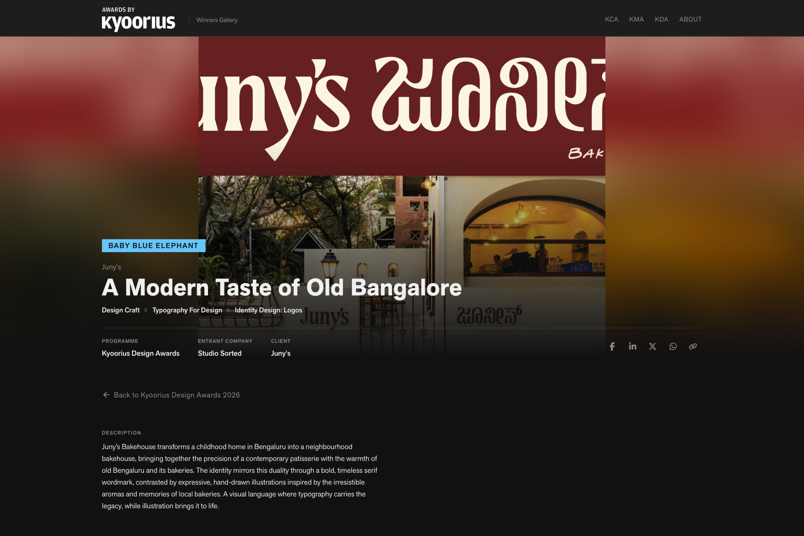
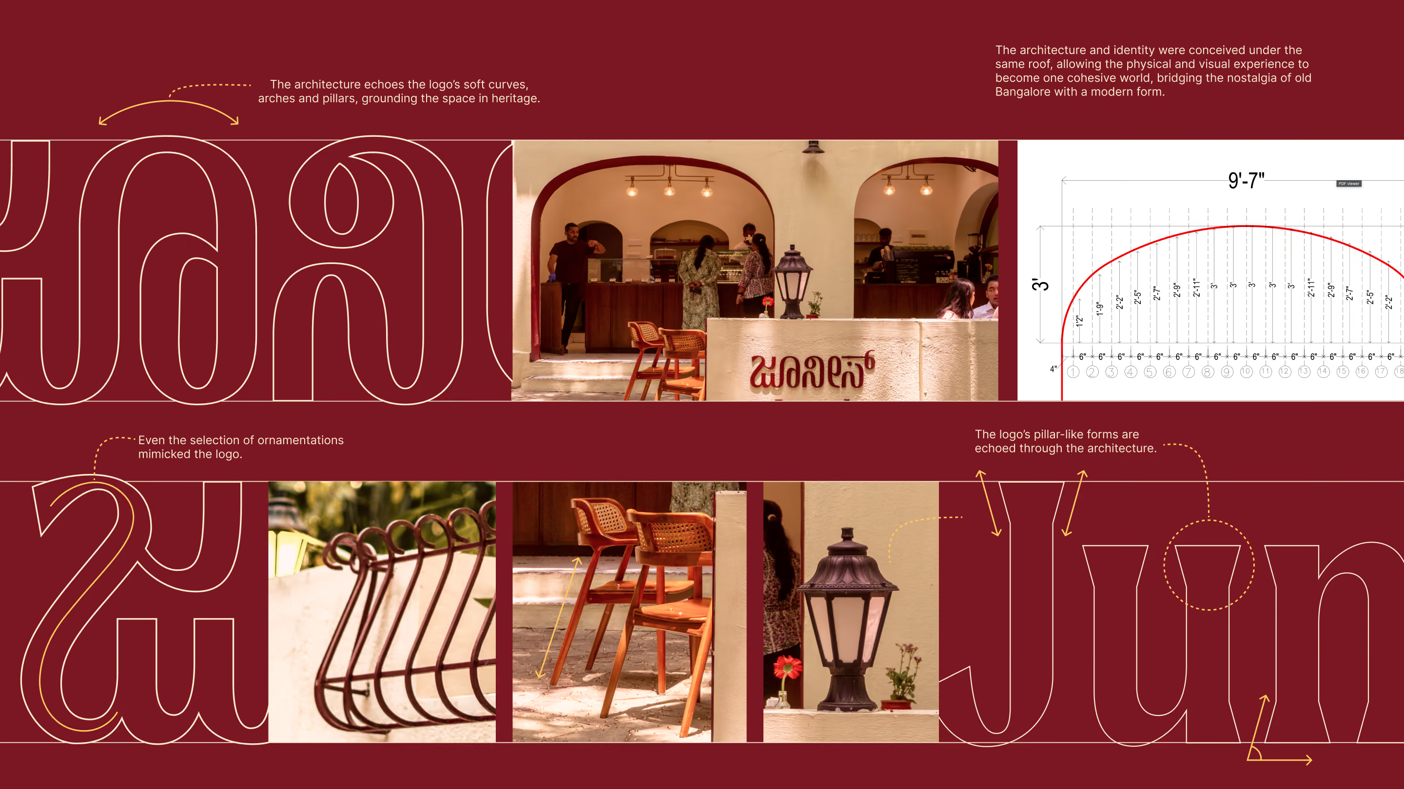
While the space itself is soft and nostalgic, the logo stands with confidence. A modern take on traditional serifs, it balances warmth with maturity—just like Juny’s itself. The Kannada adaptation mirrors this identity, using lighter weights to retain grace without losing strength. This modern classic design sets Juny’s up to scale—locally and globally—while staying grounded in its roots.
Tone & Typography
The brand voice is familiar, unfussy, and unhurried—like a handwritten note on a recipe card. We began expanding into bilingual design, with type and tone that reflect Bangalore’s layered identity.This project marked a pivotal step in our journey to craft regional and Kannada typefaces that celebrate where we come from and where we’re headed.



Illustrations
Our hand-drawn artwork is inspired by scent, warmth, and memory—those intangible triggers that make a space feel like home. With long, exaggerated noses following trails of aroma, our drawings lead with the nose, celebrating the irresistible pull of freshly baked goods.Looping lines, swishes of scent, people and pets alike—each visual detail adds to the playful, sensory world of Juny’s.


Childhood home turns Bakehouse
To call this a renovation would be inaccurate.This was conservation—of space, of story, of feeling.
We didn’t redesign Juny’s. We translated it.
The architectural intervention preserved the integrity of the original home:old floors, wooden doorways, sun-soaked verandas, and ornamental ironwork that echoes Jayanagar’s heritage. Everything was retained where possible, reinterpreted where needed.
The Outcome: Bangalore took notice
Since its opening, Juny’s has become one of Bangalore’s most beloved spaces. It’s not trend-driven. It’s time-held.
People come not just for what’s on the menu, but for what’s in the walls—nostalgia, warmth, and a kind of presence that’s rare in the city today.
Across design circles and everyday conversations, Juny’s is spoken of with a kind of quiet reverence. And that’s exactly what we hoped for.
Our work for Juny’s Bakehouse was recognised with a Baby Blue Elephant at the Kyoorius Design Awards 2026, under the Design Craft track, in the Typography For Design – Identity Design: Logos category. The recognition celebrates the distinctive typographic identity we created for Juny’s, bringing together English and Kannada lettering to reflect the cultural character of old Bangalore. Rooted in nostalgia yet designed for a contemporary neighbourhood bakehouse, the identity demonstrates how typography can carry a brand’s story, sense of place and personality.
Team
Brand Strategy & Creative direction: Abhishek Durani, Tanmay Acharya
Architects: Netra Ajjampur, Murtaza Dhilawala, Ridhi Kishore, Aishwarya Patil
Project & Contractor Management: Aishwarya Patil
Graphic design & Illustration: Tanmay Acharya, Riya Waykar, Afeef Khan
Type design: Anshul Gupta, Tanmay Acharya
Copywriting: Kashish Choudhary, Riya Waykar
Photography: Aman Bumbrah
See more restaurant design projects →