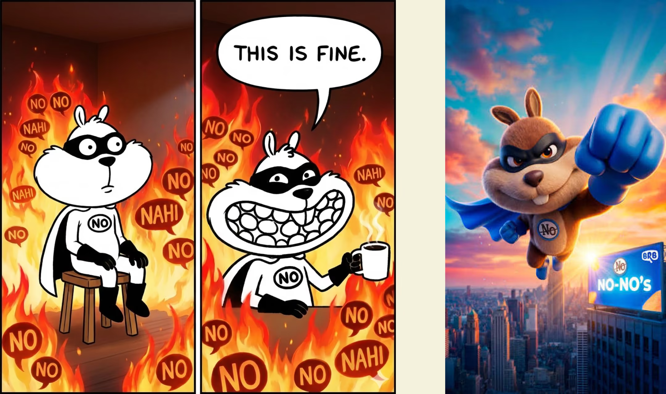
Building a Brand in a Category Full of Sameness
India's healthy snacking market has exploded over the last decade, with baked chips, popped snacks, makhana, protein crisps and millet-based alternatives filling retail shelves. Yet despite the variety, most brands still compete using the same functional claims: baked, less oil, more protein and better ingredients. As these benefits become table stakes, standing out requires more than a healthier product.
When BRB partnered with Studio Sorted to launch a new range of baked toasties, our challenge wasn't simply to design packaging. It was to build a memorable FMCG brand from the ground up. Our scope covered brand strategy, positioning, product naming, verbal identity, packaging design and launch campaign strategy.
Before designing anything, we immersed ourselves in the category. We studied competitors, analysed adjacent snack categories and mapped consumer behaviour to understand not just what people bought, but why they chose one snack over another. Our research revealed an opportunity to expand beyond BRB's existing audience by owning everyday consumption moments like binge-watching, gaming and social gatherings, while appealing to consumers already embracing baked snacks as a guilt-free indulgence.
The product already had compelling functional benefits: made with whole wheat atta, baked instead of fried, and free from palm oil. What it lacked wasn't another claim. It needed an emotional idea that consumers could instantly recognise, remember and rally behind.
Looking beyond ingredients
Most food brands begin with what the product is. We wanted to begin with what the consumer experiences. During research we noticed something interesting. Every competing brand was talking about itself.
Crunchier. Healthier. Baked. Protein-rich. Low fat. No palm oil.
Those claims matter, but they're difficult to own because everyone can make similar promises.
Instead of searching for another product claim, we searched for a cultural observation that belonged to consumers rather than the category.
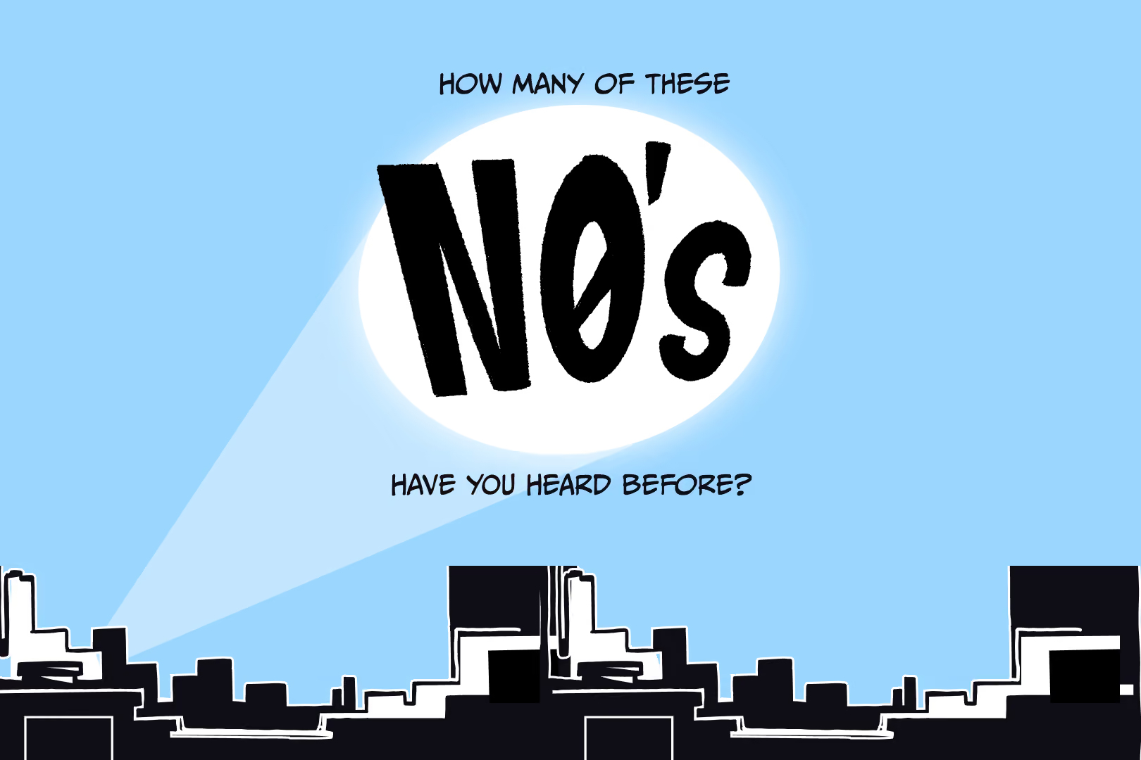
That's where the idea of "No" emerged.
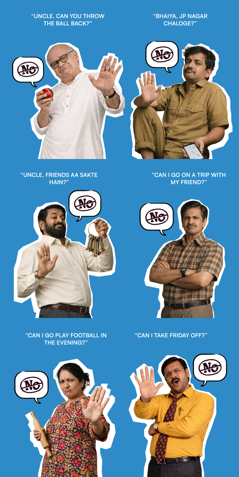
Regardless of age, language or geography, everyone grows up hearing "No."
No, you can't stay out late. No, not today. No, don't touch that. No holidays. No extra leave. No second serving. "No" is one of the few experiences almost every Indian shares.
It wasn't a product insight. It was a human insight. That became the emotional territory the brand could own.
Creating a brand instead of
naming a product
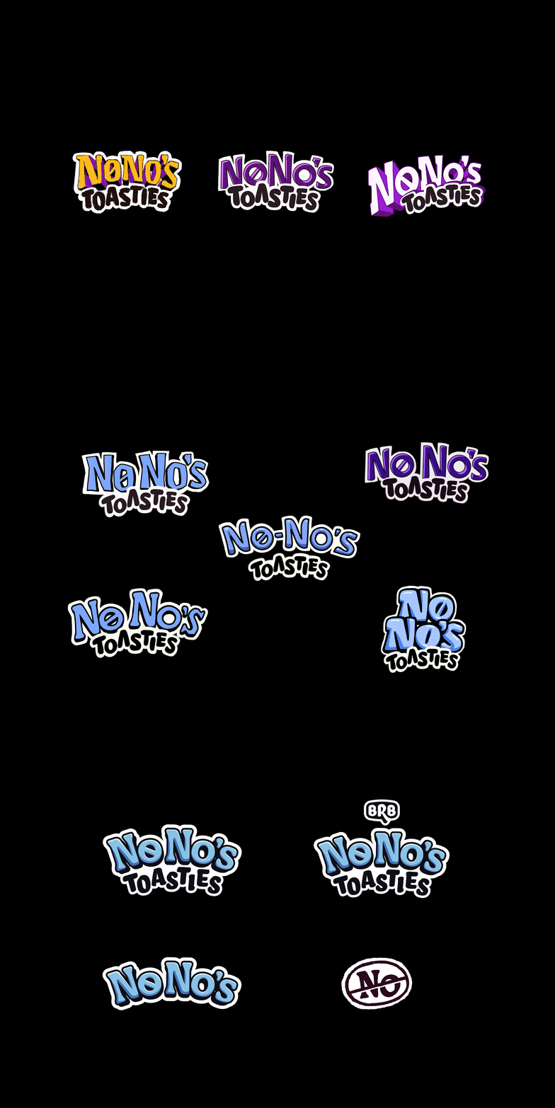
Once the strategic territory was established, the name became surprisingly straightforward.
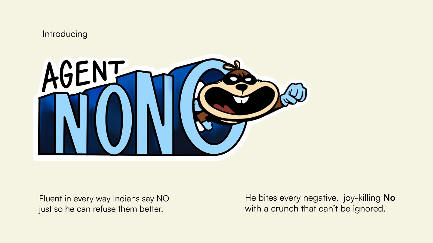
NoNo's wasn't created simply because it sounded playful. It solved multiple strategic problems simultaneously. It was easy to remember. Easy to pronounce across languages. Highly conversational. Immediately distinctive within the category. Most importantly, it generated language rather than limiting it. Campaign ideas, headlines and conversations naturally emerged from the name itself.
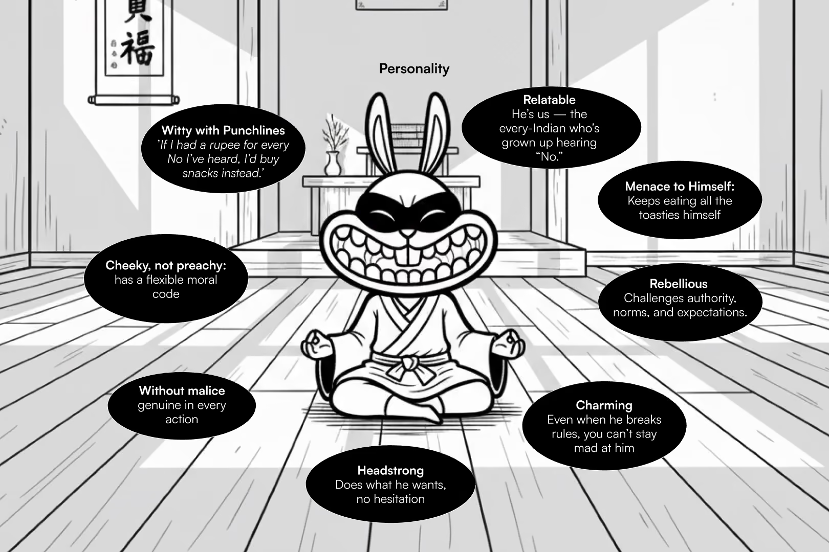
Rather than describing baked toasties, the name gave the brand an identity that could extend across packaging, advertising, social media and future product launches.It also aligned perfectly with the personality we had collectively defined for the product: playful, contemporary, energetic, loud and slightly cheeky, with the confidence of someone entering adulthood without taking themselves too seriously.
Good product names identify. Great product names create possibilities.
Designing a Character That Could Grow With the Brand
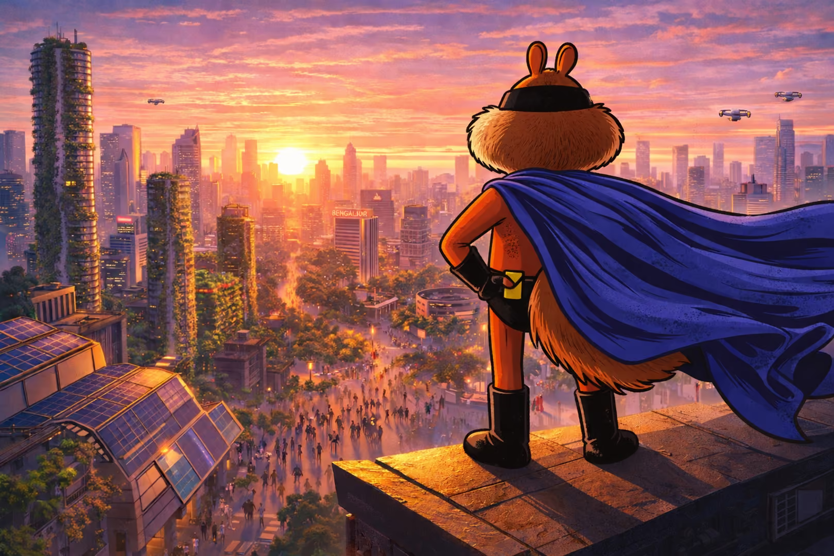
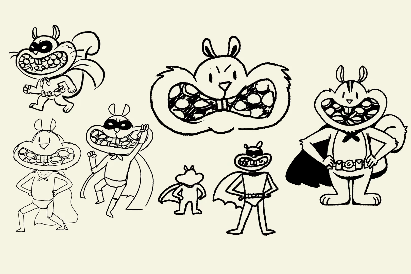
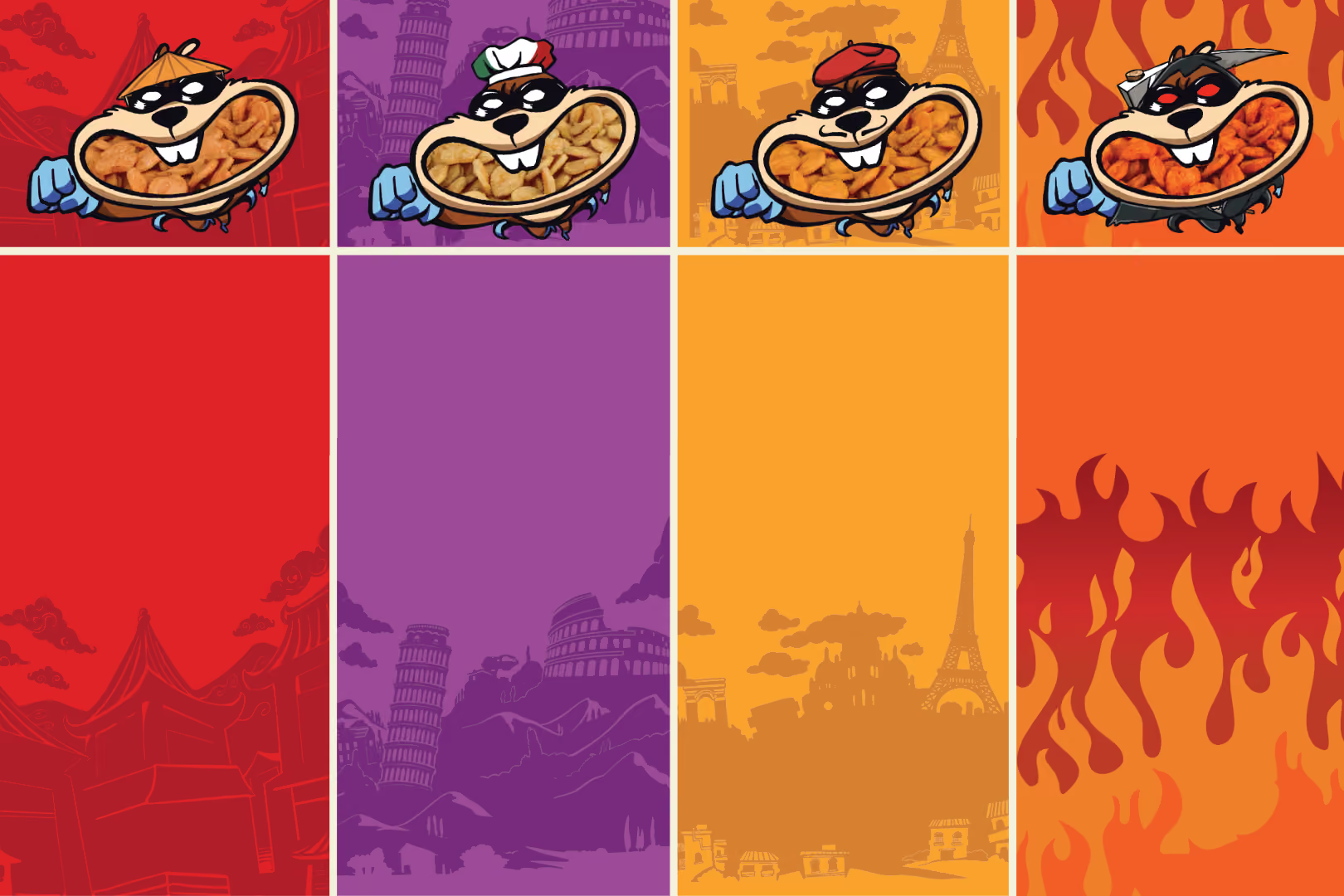
For NoNo's, the mascot was never intended to be a decorative element on the packaging. It was conceived as the brand's central character: someone consumers could recognise, relate to and encounter across every touchpoint. Early exploration considered several animal archetypes, including rhinos, cats, dolphins and chipmunks, each representing different personality traits and strategic directions. Ultimately, we chose a curious, mischievous chipmunk that embodied the brand's playful optimism while deliberately establishing distance from existing category mascots and legacy associations.
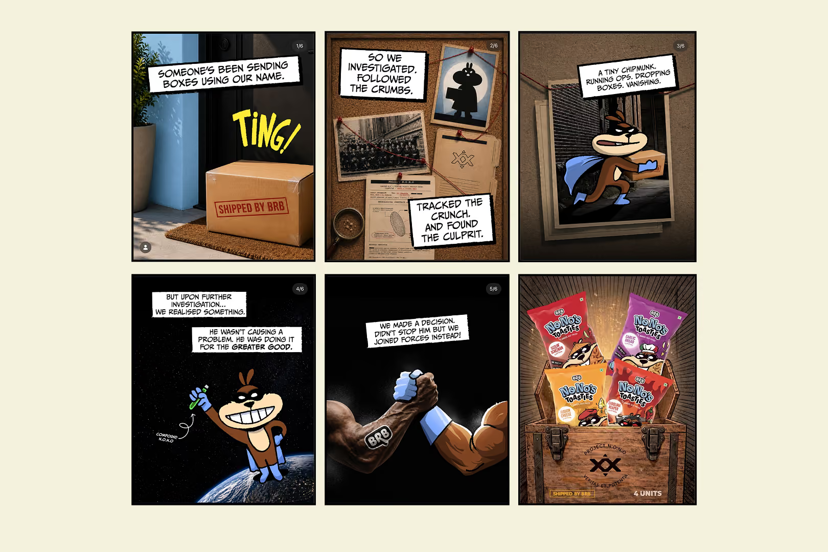
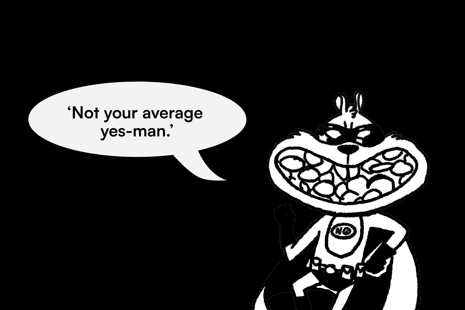
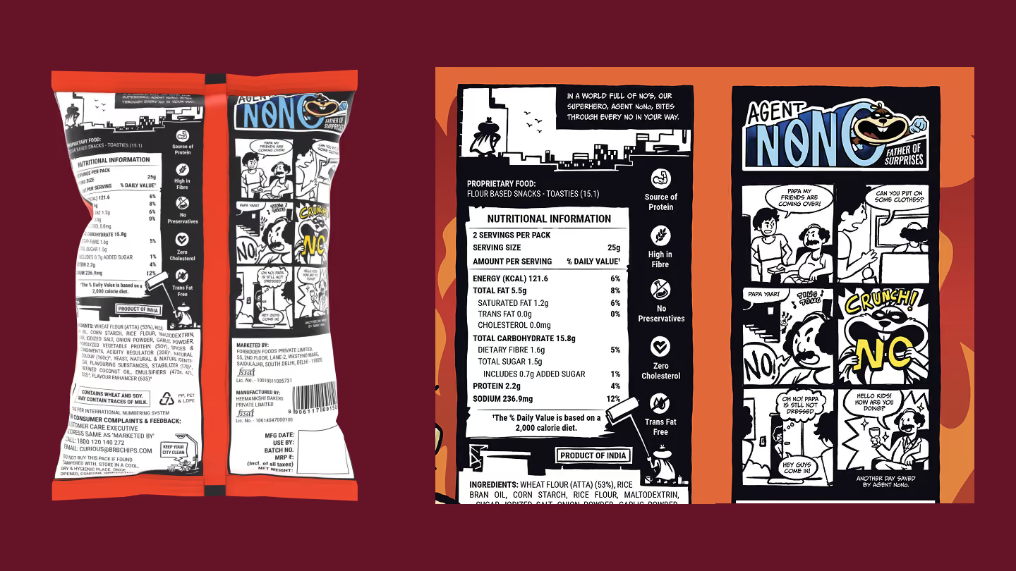
Rather than existing only on the pack, Agent NoNo became the voice of the brand, carrying the same cheeky personality across packaging, animation, PR experiences and social media.
By designing a character with purpose instead of simply creating a mascot, we gave NoNo's a recognisable identity capable of growing alongside future products, campaigns and conversations.
Designing a packaging system that could compete on shelf
Packaging is often judged by how beautiful it looks. Retail shelves judge it differently.
Can consumers find it? Can they understand it? Can they remember it after walking away? Every design decision was therefore made around recognition before decoration.
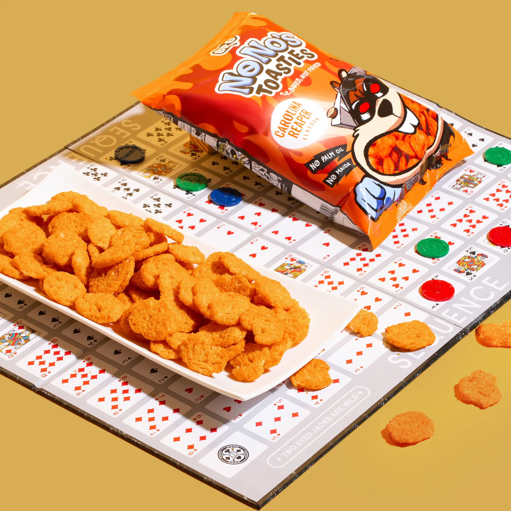
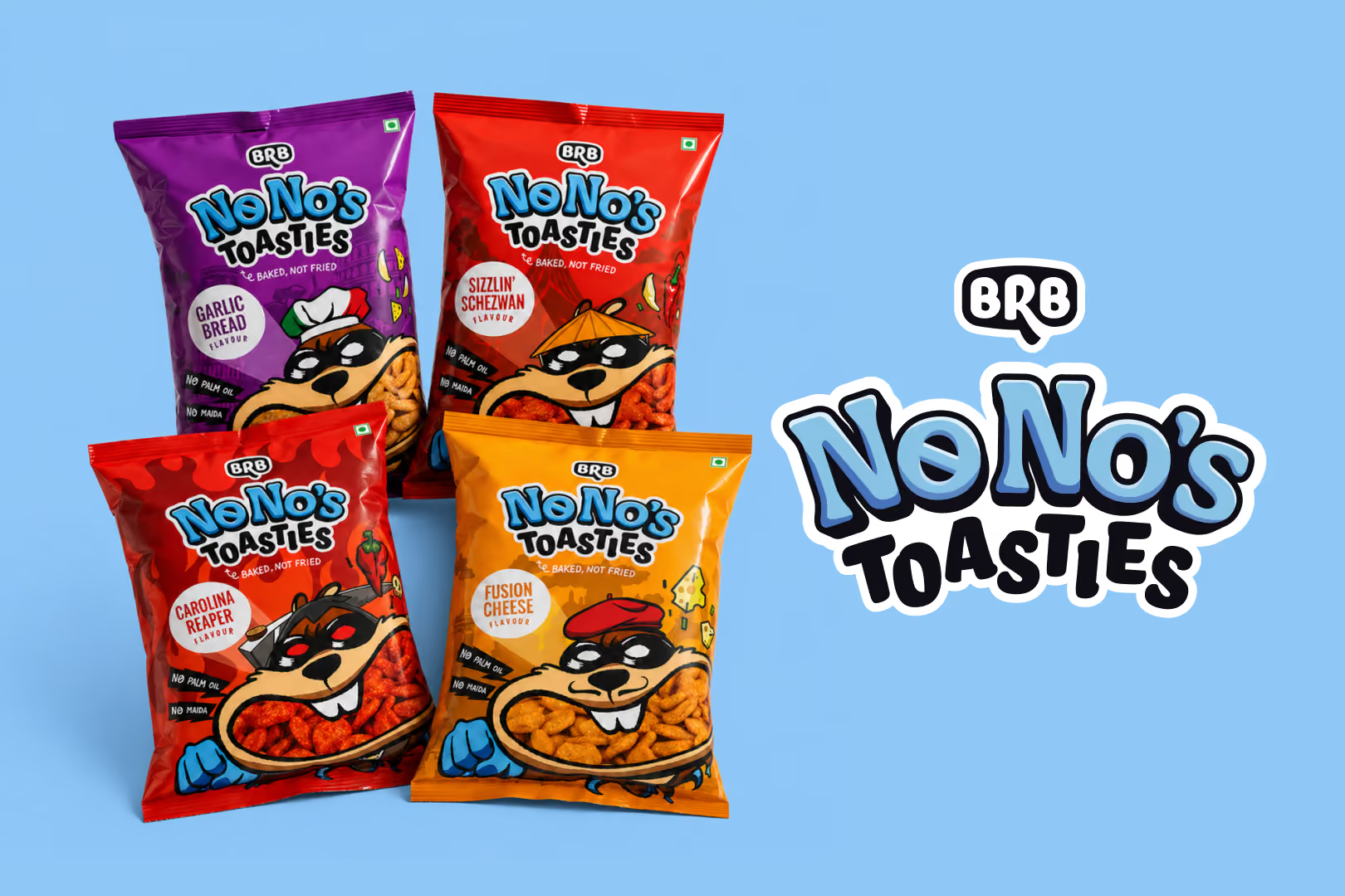
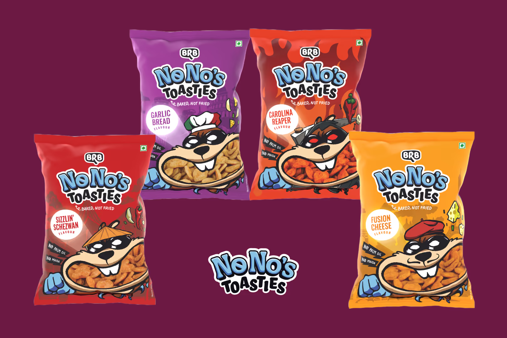
The visual system balanced appetite appeal with strong shelf interruption. Bold colours differentiated individual flavours while maintaining a consistent family resemblance across the range. The illustration style introduced personality without compromising product clarity, allowing the packs to feel playful while still communicating key functional benefits such as baked, no maida and no palm oil.
The hierarchy was intentionally simple. First, consumers recognise the brand. Then the flavour. Then the reason to believe. Only after that do they discover the supporting information. Rather than treating each SKU as an independent design exercise, we developed a scalable packaging architecture capable of accommodating future flavour expansions while preserving immediate brand recognition.
The result wasn't simply four packs. It was a packaging system.
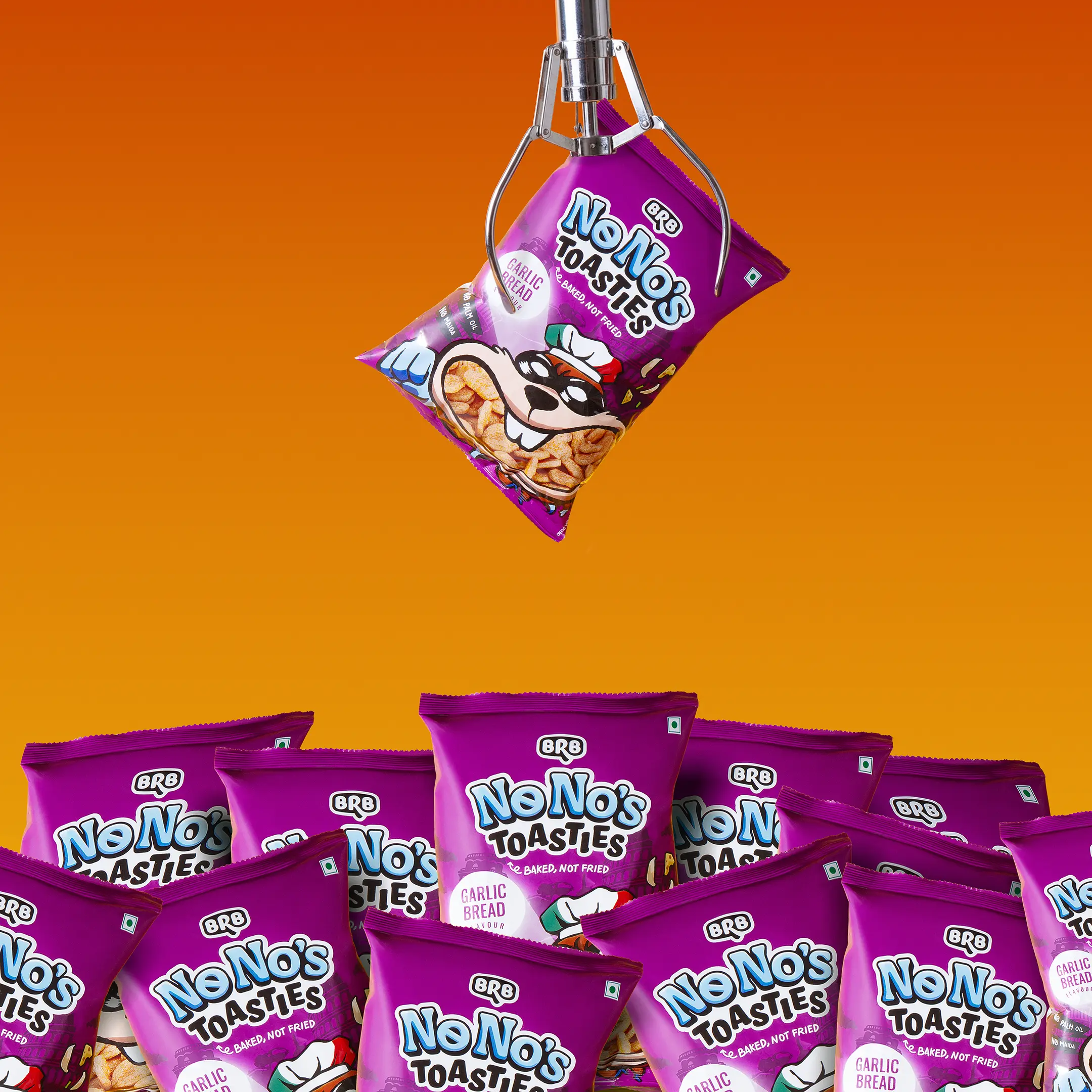
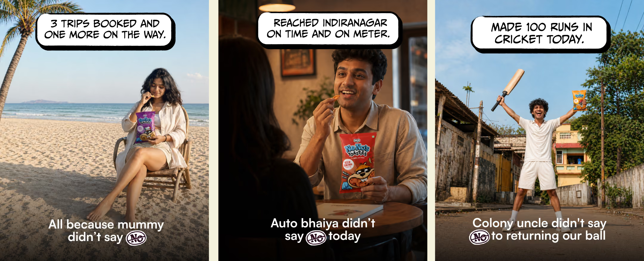
A product launch rarely succeeds because of packaging alone. Consumers encounter brands across dozens of touchpoints long before they decide to purchase. That meant NoNo's needed a launch system rather than a launch campaign. Instead of introducing the product immediately, the campaign began by introducing an idea everyone could relate to: the everyday "No." Our content strategy explored familiar situations where people constantly encounter unnecessary refusals, turning these moments into humorous, shareable conversations across social media. Rather than leading with product shots, the campaign first built recognition around a feeling. Only after establishing that emotional territory did the product enter the narrative.
This phased approach allowed the audience to engage with the brand before asking them to care about the snack.
Building a campaign ecosystem
Every campaign asset was designed to reinforce the same central idea rather than behave as isolated pieces of content.
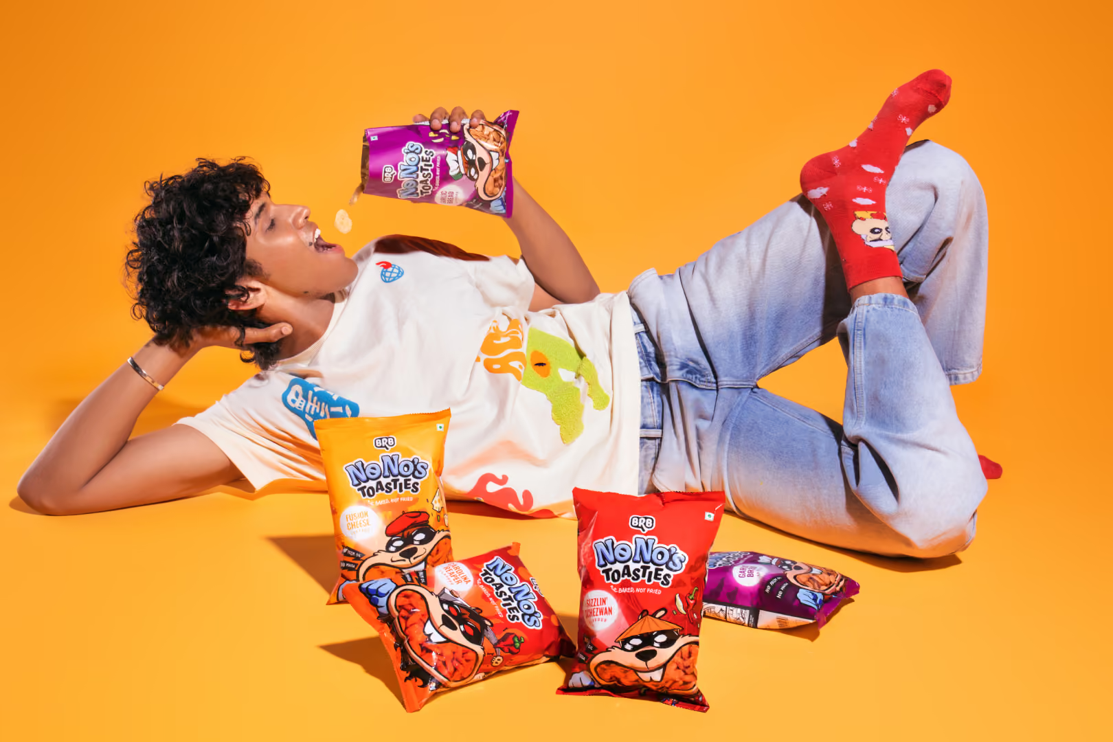
The launch roadmap included content strategy, campaign narratives, creator collaborations, social-first storytelling, PR experiences and physical activations, all working together as one coherent system. Instead of producing disconnected Instagram posts, we developed recurring content pillars around everyday "No's", cultural humour, creator collaborations, community participation and playful interactions with other brands. This allowed the brand to build familiarity through repetition while keeping the format fresh.
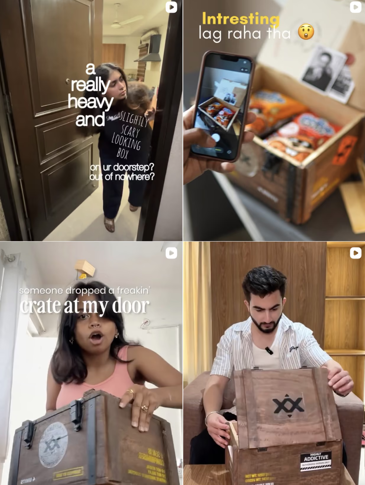
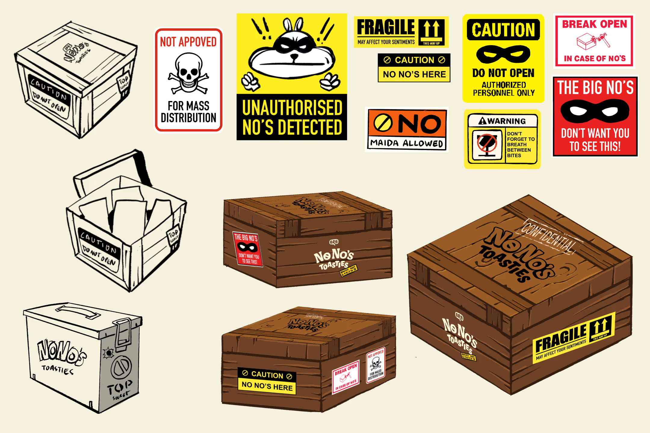
Even the PR experience was designed as an extension of the same narrative rather than a standard product sample, creating curiosity before consumers ever encountered the snack itself.Every touchpoint answered the same question.
What would a brand built around saying "No" actually behave like?