Only What's Needed (OWN)

Designing India’s first publicly co-created food brand

About
Industry: Food & Nutrition
Services: Brand Strategy, Naming, Visual Identity, Packaging Design
Approach: Participatory Design + Information Systems
Outcome: A transparency-led brand, built with its audience
Year: 2025
Status: Completed, Buy now!
Studio Sorted designed the brand strategy, identity, and packaging system for Only What’s Needed (OWN) — a transparent food brand launched by FoodPharmer Revant Himatsingka.
We took this on as a pro-bono collaboration, recognising early that this was not just a branding exercise, but a public-interest problem.
What began as a mission to make food labels easier to understand quickly evolved into something larger:
A brand built not just for people, but with them.
Transparent food packaging design for OWN brand showing ingredient clarity and nutrition hierarchy
Packaging design for OWN, a transparent food brand in India, showing front-facing nutrition information, ingredient clarity, and clean label communication system
Studio Sorted designed the brand strategy, identity, and packaging system for Only What’s Needed (OWN), the transparent food brand launched by FoodPharmer (Revant Himatsingka).
The Context
Over the years, FoodPharmer’s Label Padhega India movement has fundamentally changed how people engage with packaged food in India.Millions began reading labels more closely, questioning ingredients, and challenging misleading claims.But this shift exposed a deeper contradiction.Even when people knew what to look for, the way information was presented remained: fragmented, difficult to interpret, buried in hierarchy, shaped by marketing.

Transparency had become a widely used word.
But rarely a designed system.
The Opportunity: From reading labels to defining them
The opportunity was not to create another “clean” food brand.It was to respond to a new kind of consumer:
Someone who reads, questions, and verifies.This required moving beyond communication and into structuring information itself.

OWN was envisioned as a brand that aligns with this behaviour, not one that tries to influence it.

From audience to participants
OWN was built through a process of participatory design, where decisions were opened up at the right stages to the public.Through FoodPharmer’s platform, people were asked:
What do you actually look for on a label?
What feels misleading?
What do you want to see more clearly?
How should information be presented?

These inputs formed the foundation of the brand.Studio Sorted’s role was to structure this process — ensuring that participation remained meaningful, and that insights could be translated into a coherent, scalable system.

The result was not just visibility into the process, but representation within it.
Our Role: Designing a system of Clarity
Studio Sorted partnered on the project to translate this shift into a brand that could operate at scale while remaining accountable to the people shaping it.
Our role was to:
- Define the strategic foundation of the brand
- Structure a participatory design framework
- Synthesise public input into clear decisions
- Design the identity and packaging system
- Establish principles that remove ambiguity

This was approached not as a client brief, but as a shared responsibility to design something that could stand up to public scrutiny.
Only What’s Needed packaging design by Studio Sorted
Naming
A name that holds the brand accountableIn a category built on claims and persuasion, the name had to function differently. It needed to be direct, repeatable, self-explanatory & difficult to manipulate.
The answer was simple.

Only What’s Needed.

The name doesn’t position the brand. It defines its constraint. Everything included must justify its presence. Shortened to OWN, it reinforces responsibility — shifting ownership of health back to the consumer.
Modular packaging design system for food brand ensuring clarity and consistency across products
The Packaging System
From Label Padhega India to Label Likhega India

For years, Label Padhega India encouraged people to read food labels. With OWN, the process evolved into Label Likhega India — asking people what they want written on them. Through this, we gathered insights on: what information matters most, what people ignore, what creates confusion, what builds trust
These insights became the starting point for designing the packaging system.

DESIGN LANGUAGE: Removing bias from information
Every design decision was guided by one principle:If it influences interpretation, it must be questioned. This led to neutral, functional typography, restrained colour usage, illustrations that only clarify, never decorate.

The visual system avoids persuasion and instead supports understanding.
Packaging design with front-facing nutrition information for whey protein brand OWN in India
Food packaging design displaying product testing and certification details on front of packOWN protein packaging front label transparencyPackaging hierarchy design showing order of information from product name to nutrition details
The Design System
INFORMATION HIERARCHY: Putting the back on the front
Most packaging separates persuasion and information. OWN removes that distinction. The system was designed so that the most important information appears immediately, in a clear and controlled sequence: Product and flavour; Protein quantity; Ingredient composition; Nutrition information; Supporting details

By controlling order, the design reduces cognitive effort and removes dependency on discovery.

DATA VISUALISATION: Making composition instantly clear
Ingredient lists alone are difficult to process.To improve clarity, ingredient proportions were visualised using simple, part-to-whole representations. This allows people to understand quickly: what the product is primarily made of; how components compare

The goal was not analysis. It was immediate comprehension.

ACCESSIBILITY: Information without barriers
If transparency is the goal, accessibility becomes essential. The packaging integrates: QR-based translations into multiple Indian languages, visual cues for interaction, braille elements for inclusivity.

This ensures that information is available across contexts, not limited by language or familiarity
Ingredient proportion visualisation in packaging design showing whey protein composition breakdown
THE RESULT: A brand shaped by the people it serves
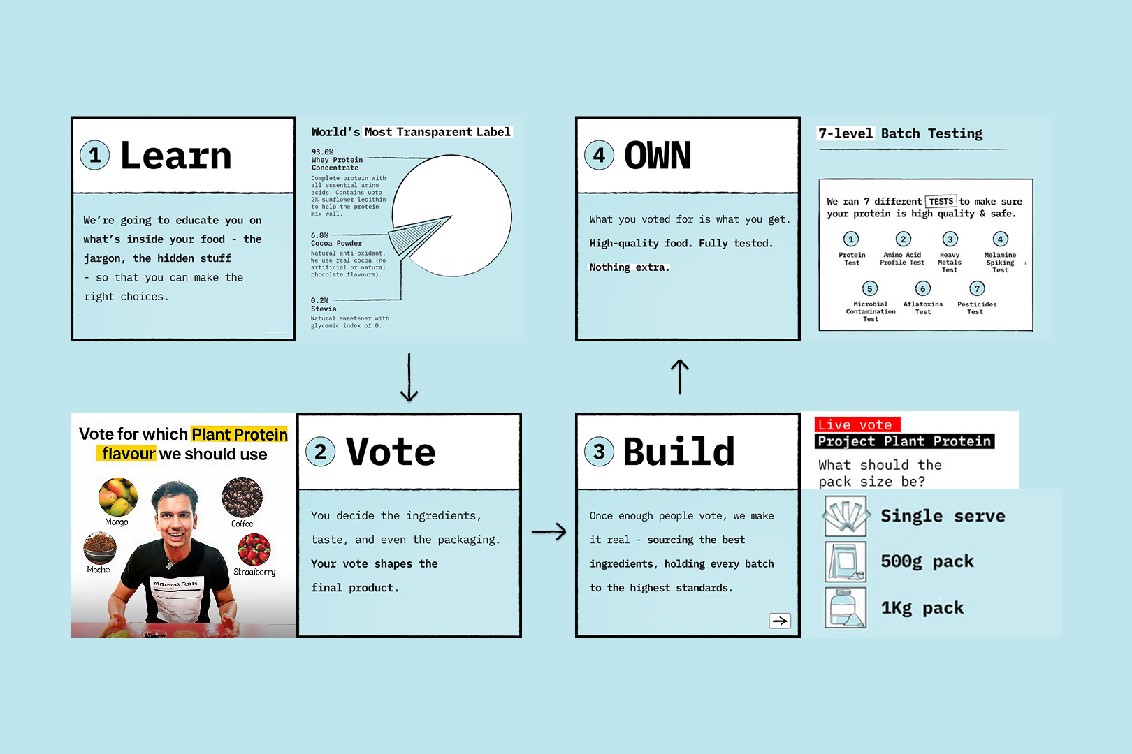
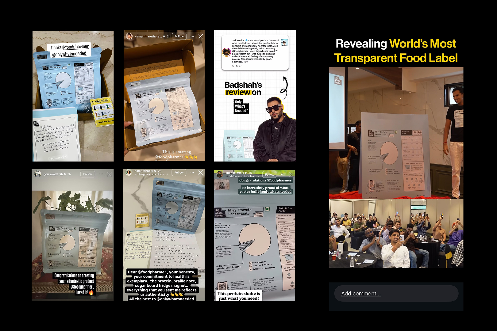
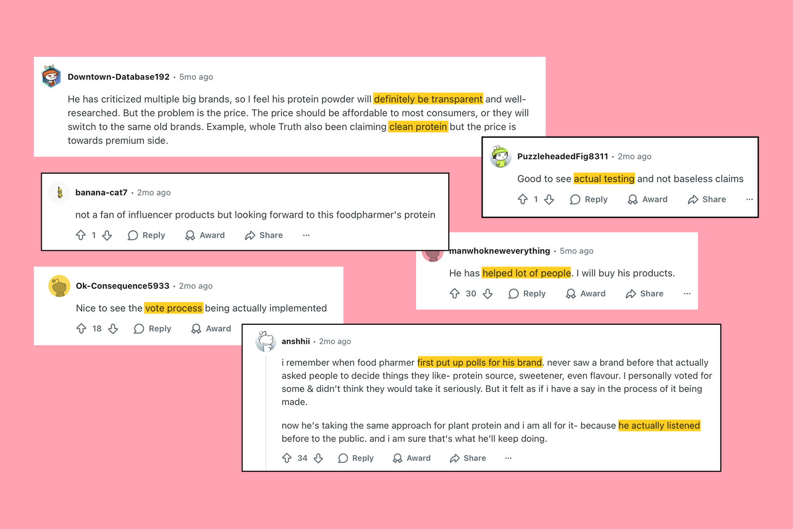
OWN launched with large-scale participation, with over 33,000 people contributing to the process at various stages. The project has since generated widespread discussion across: startup and marketing communities, design circles, consumer awareness platforms

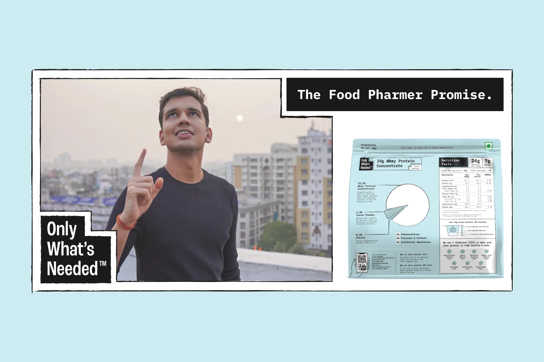
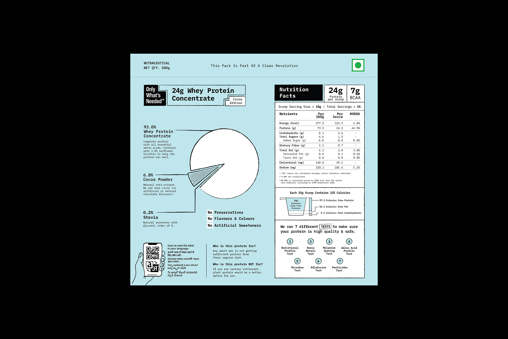
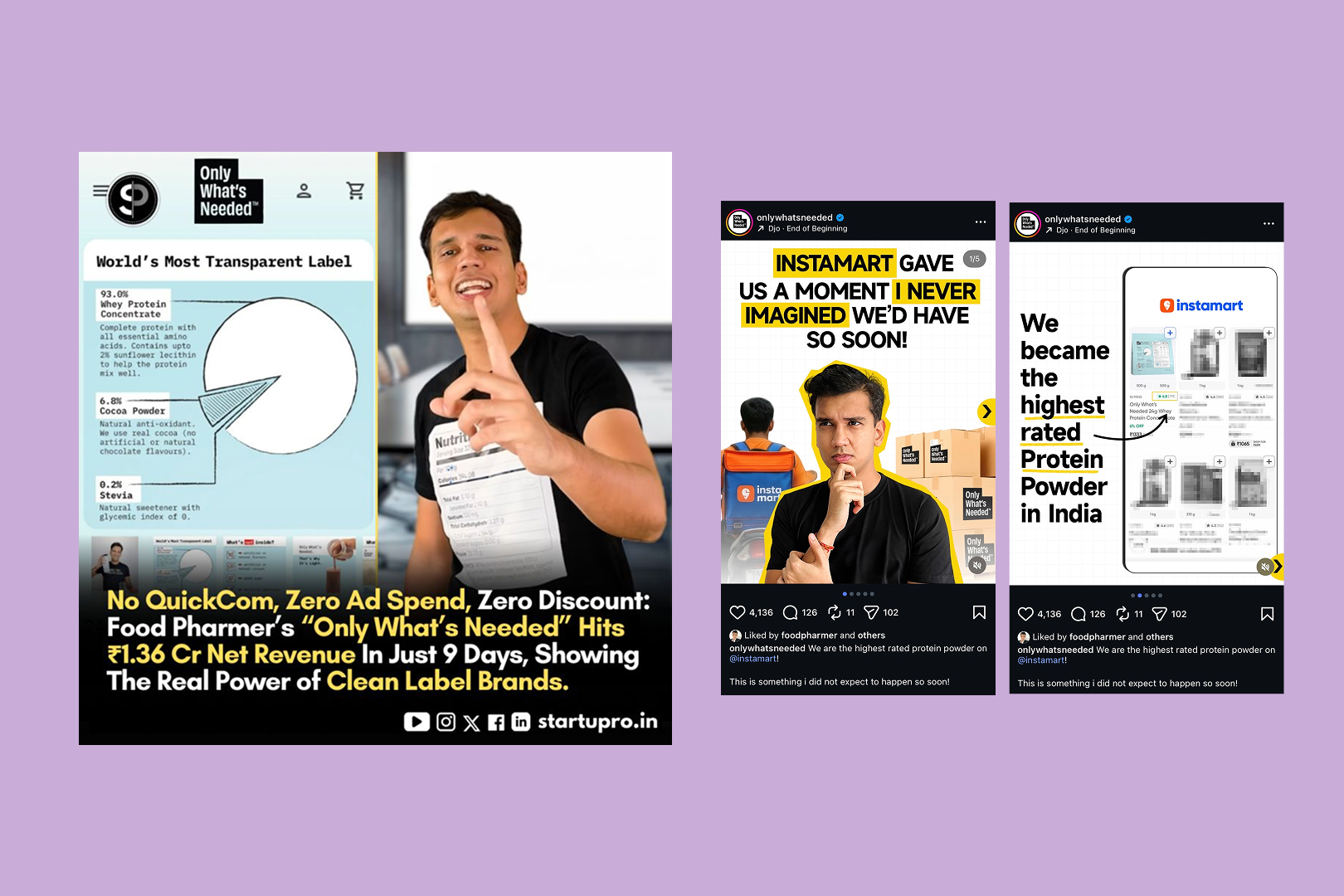
The packaging is frequently referenced as a shift toward information-first branding, transparent label systems, participatory brand building.

From messaging to structure, OWN challenges the idea that trust is built through communication alone. Instead, it shows that trust is built through clarity, structure and consistency. It reframes branding from something that persuades to something that enables informed choice.

Designing for transparency changes the role of design itself. It shifts from: storytelling to structuring, persuasion to explanation, branding to accountability.

When information becomes the primary material, every decision carries weight. What is shown, how it is shown, and what is left out all define how a brand is understood.
Social media content showing participatory branding approach where consumers help shape product decisions
Full case-study out soon!
Team
Brand strategy, identity, and packaging system for Only What’s Needed (OWN) were designed by Studio Sorted in collaboration with FoodPharmer Revant Himatsingka and the public community that participated in shaping the brand.

Creative Direction: Abhishek Durani
Brand Strategy: Abhishek Durani, Vrinda Gupta
Graphic design: Anshul Gupta, Shreya Agarwal
Copywriting: Kashish Choudhary
FAQs
Who designed the Only What’s Needed brand?
Studio Sorted designed the brand strategy, identity, and packaging system for Only What’s Needed (OWN) in collaboration with FoodPharmer Revant Himatsingka.

What is Only What’s Needed?
Only What’s Needed (OWN) is a transparent food brand focused on clean ingredients and clear labeling.

What makes OWN packaging unique?
OWN packaging prioritises information hierarchy, ingredient transparency, and accessibility, making labels easier to read and understand.

What is participatory branding?
Participatory branding involves building a brand with input from its audience/users, allowing users to influence decisions such as naming, packaging, and communication systems.

What is transparent food packaging?
Transparent food packaging is a system where all relevant product information is presented clearly, without manipulation, omission, or marketing bias.