The story behind Gabru, a bottle-shaped mascot, and a rebrand designed to take an Indian cold coffee business from local recognition to national relevance.
Better coffee? More affordable pricing? More outlets?
For Theka Coffee, an Ahmedabad-born brand featured on Shark Tank India, the answer involved all three. But there was another challenge that couldn't be solved by the product or distribution alone.
How do you make specialty coffee feel familiar to someone who has never cared about specialty coffee?
Coffee has an interesting problem in India.
For decades, it has existed comfortably in our homes, roadside stalls, canteens and cafés. Yet, specialty coffee has often been presented as something more exclusive, surrounded by conversations about origins, roasts, brewing techniques and tasting notes.
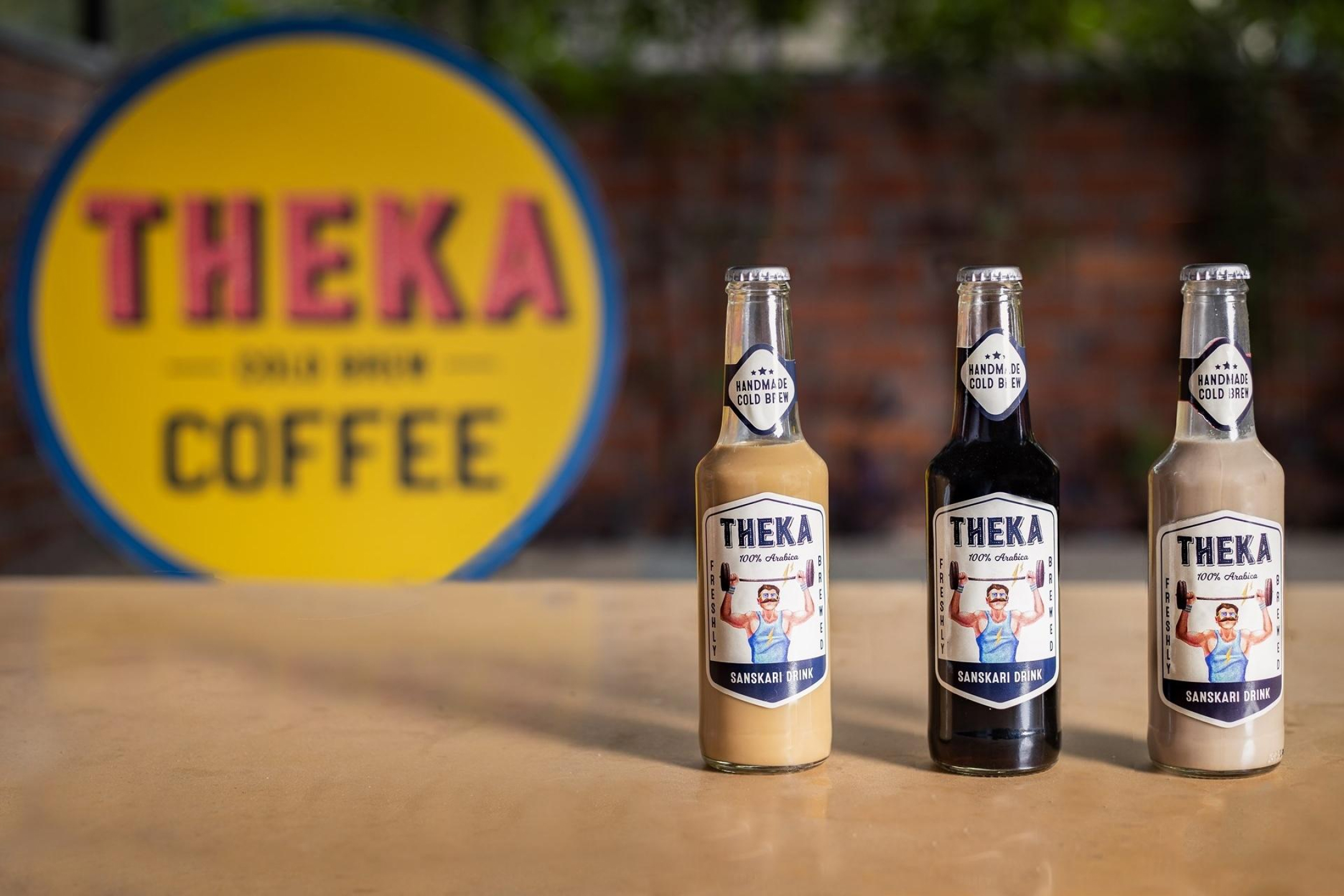
There is genuine value in that knowledge. But not every customer wants to learn a new vocabulary before buying a drink. Theka Coffee understood this distinction early. Instead of relying on the conventions of premium coffee chains, Theka sold cold-brewed Arabica coffee in beer-style glass bottles, with memorable names, accessible pricing and an unmistakably desi personality.
When Theka approached Studio Sorted for a rebrand in 2022, the business already had a distinctive proposition. Our challenge was to take what made Theka special and turn it into a cohesive identity that could connect with consumers across India. And one of the most important parts of that identity was Gabru: A character who wore chappals, spoke through his eyes and, quite literally, was the product he represented.
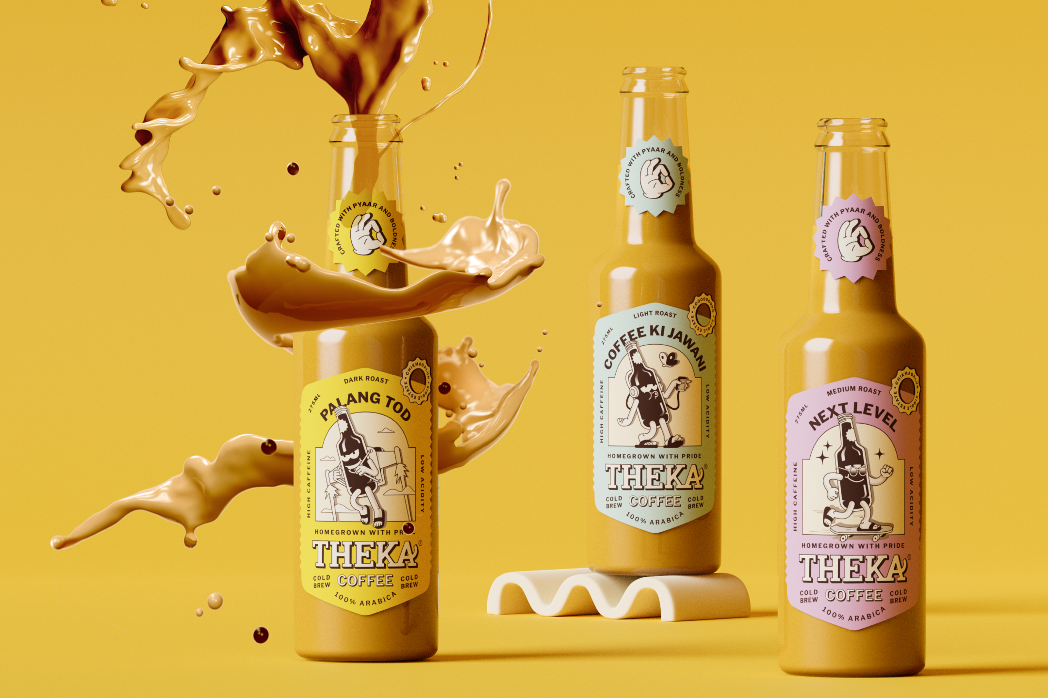
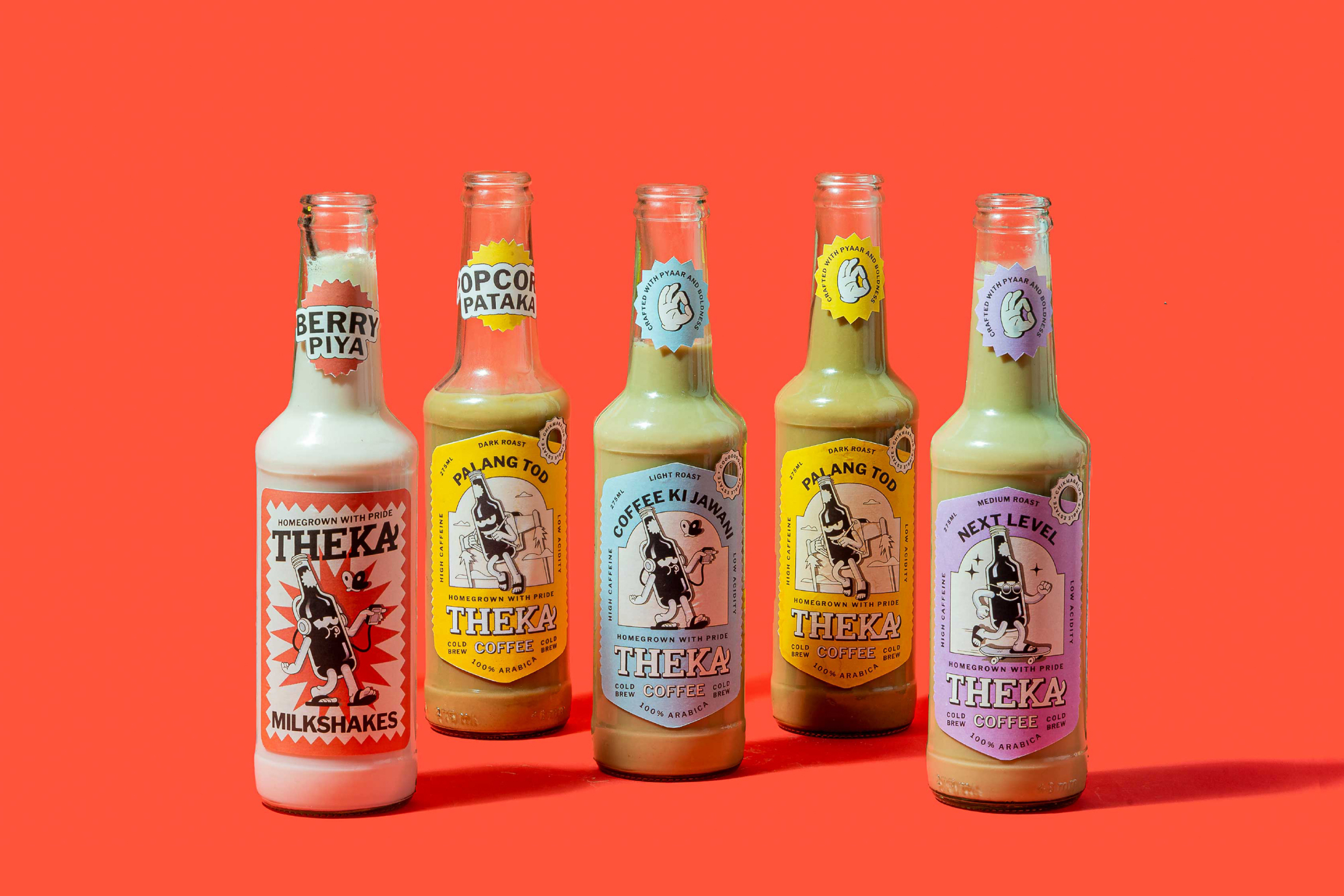
Founded in Ahmedabad in 2017 by Bhupinder Madaan, Theka Coffee began with a simple proposition: make quality coffee accessible to a wider audience. The brand offered freshly brewed Arabica coffee in an unconventional format. Instead of traditional takeaway cups, customers received coffee in glass bottles resembling beer bottles. That choice was more than a packaging decision. The bottles made the product distinctive, while the brand's name and playful language brought it closer to everyday Indian culture. The original range included coffees such as Palangtod, Next Level and Coffee Ki Jawani, with varying strengths and flavours.
In an April 2022 interview with YourStory, Madaan described selling coffee at around ₹100 and starting the business by selling bottles from his car on the streets of Ahmedabad. The company subsequently experimented with cafés, but faced substantial challenges during the pandemic. By June 2020, all 14 of its café outlets had closed. Theka eventually returned to a lower-investment model built around carts and kiosks. Its appearance on Shark Tank India's first season in January 2022 gave the business national visibility, even though it did not secure investment from the Sharks. YourStory.com
Theka had already demonstrated the appeal of doing things differently. But as the business prepared to grow across Indian cities, its identity needed to become more consistent, recognisable and adaptable.
This is where the rebrand came in.
Rebranding an existing business comes with a different set of responsibilities from building a new brand. You aren't starting with a blank canvas. Customers already have associations with its name, products and personality. Those associations might be among the company's most valuable assets.
For Theka, we identified three interconnected challenges.
First, communicating the value of good coffee to a wider audience. Theka's cold-brewed coffee offered a different product experience, but its quality and variations needed to be understandable to consumers who might not be familiar with specialty coffee terminology.
Second, balancing familiarity with freshness. Theka already had a loyal audience and a distinctive personality. A rebrand needed to retain that recognition while introducing a more developed visual identity.
Third, designing an identity capable of scaling nationally. The brand needed to work across different cities, customer profiles, packaging formats, physical outlets and marketing campaigns.
These challenges required us to look beyond aesthetics. The answer wasn't simply to make Theka look more premium. It was to make the brand more accessible, expressive and consistent while preserving the attributes that made people notice it in the first place.
For a business whose ambition included reaching customers in Tier 2, Tier 3 and smaller Indian cities, this distinction mattered. Theka didn't need to look like every other specialty coffee brand. It needed to look unmistakably like Theka.
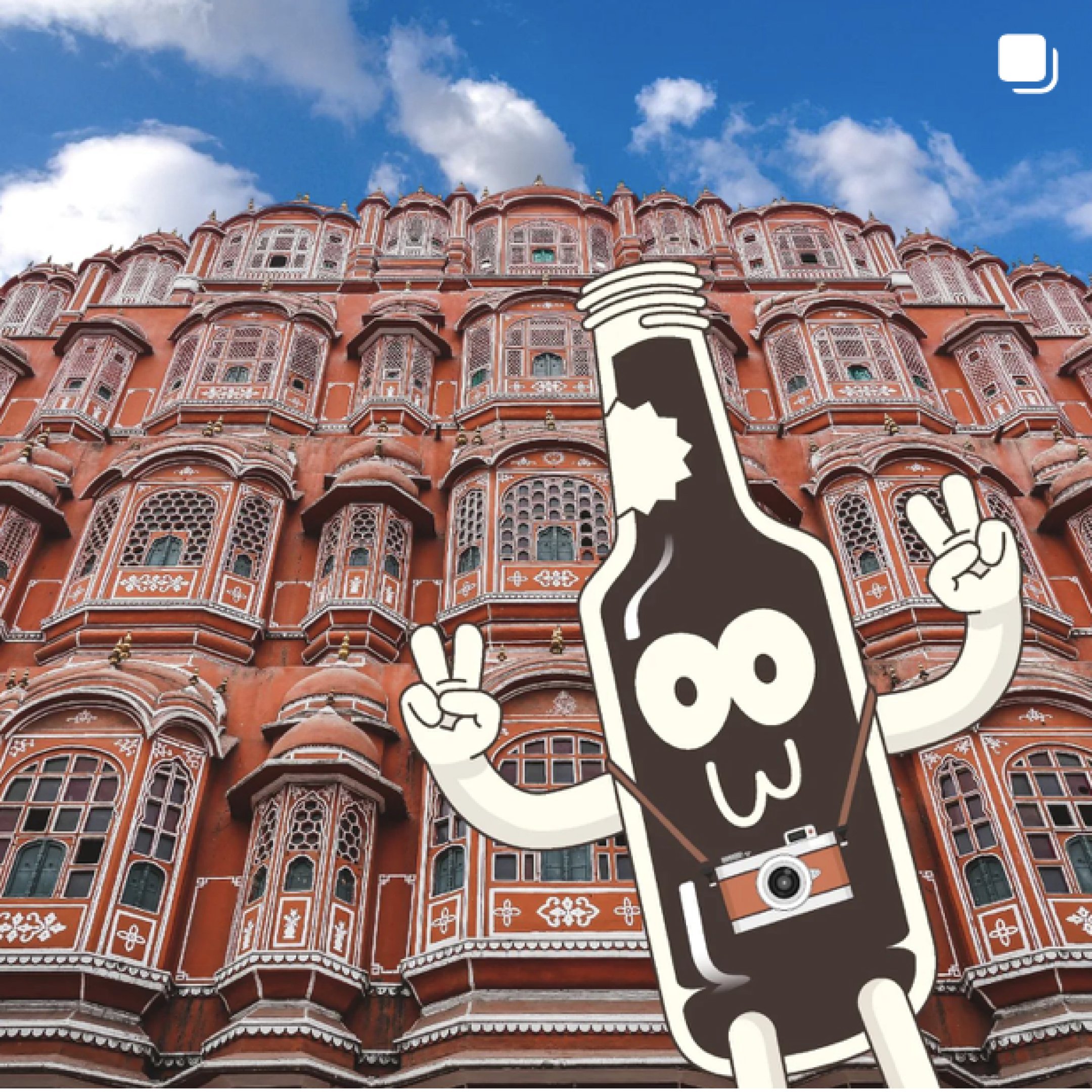
One of the most recognisable outcomes of the rebrand was Gabru, Theka Coffee's mascot. But unlike mascots that exist independently of the products they represent, Gabru was built around Theka's most distinctive physical asset.
The bottle itself.
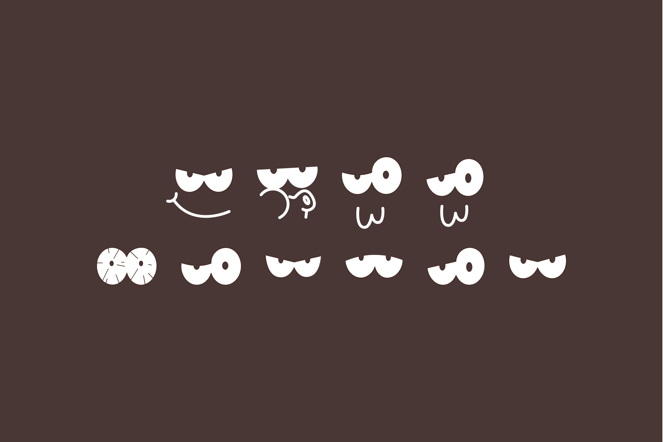
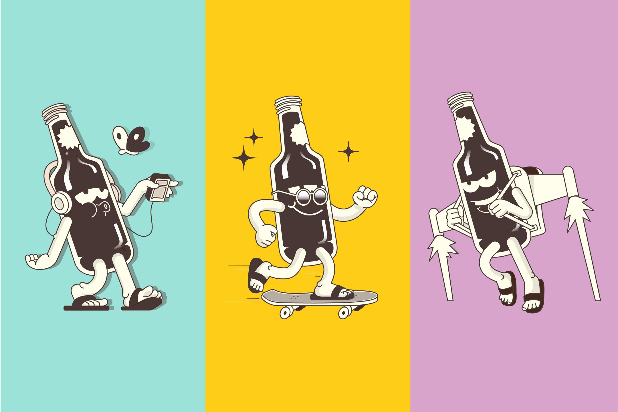
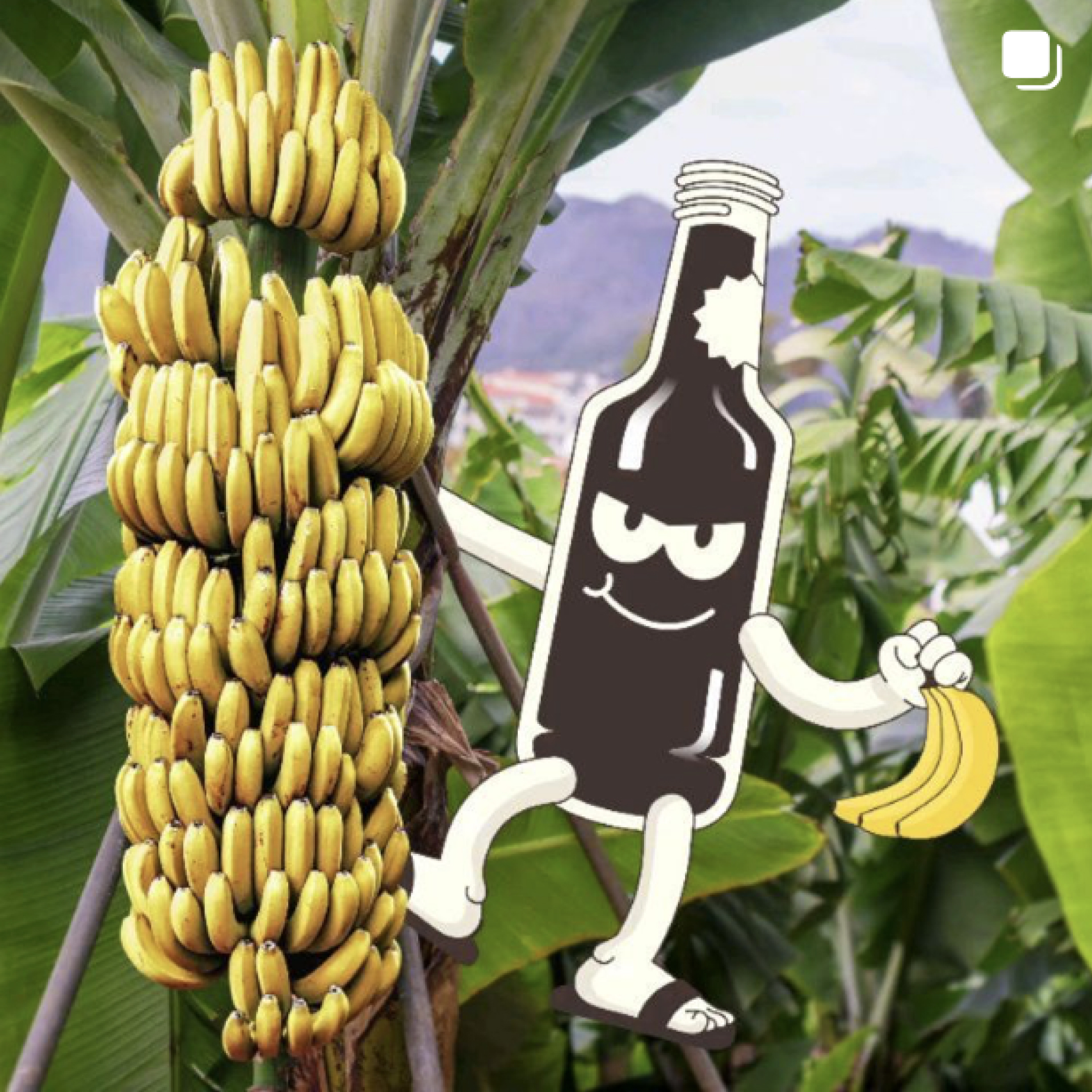
We took the silhouette of Theka's iconic coffee bottle and brought it to life. Gabru wore chappals, had an unmistakably desi attitude and used his eyes to convey an extraordinary range of expressions. His appearance could change, but his underlying form remained recognisable. He could be playful, mischievous, confident, energetic or relaxed, depending on the situation. This gave Theka a character that felt human without losing its direct connection to the product. And it gave us a visual storytelling device that could extend far beyond a single illustration.
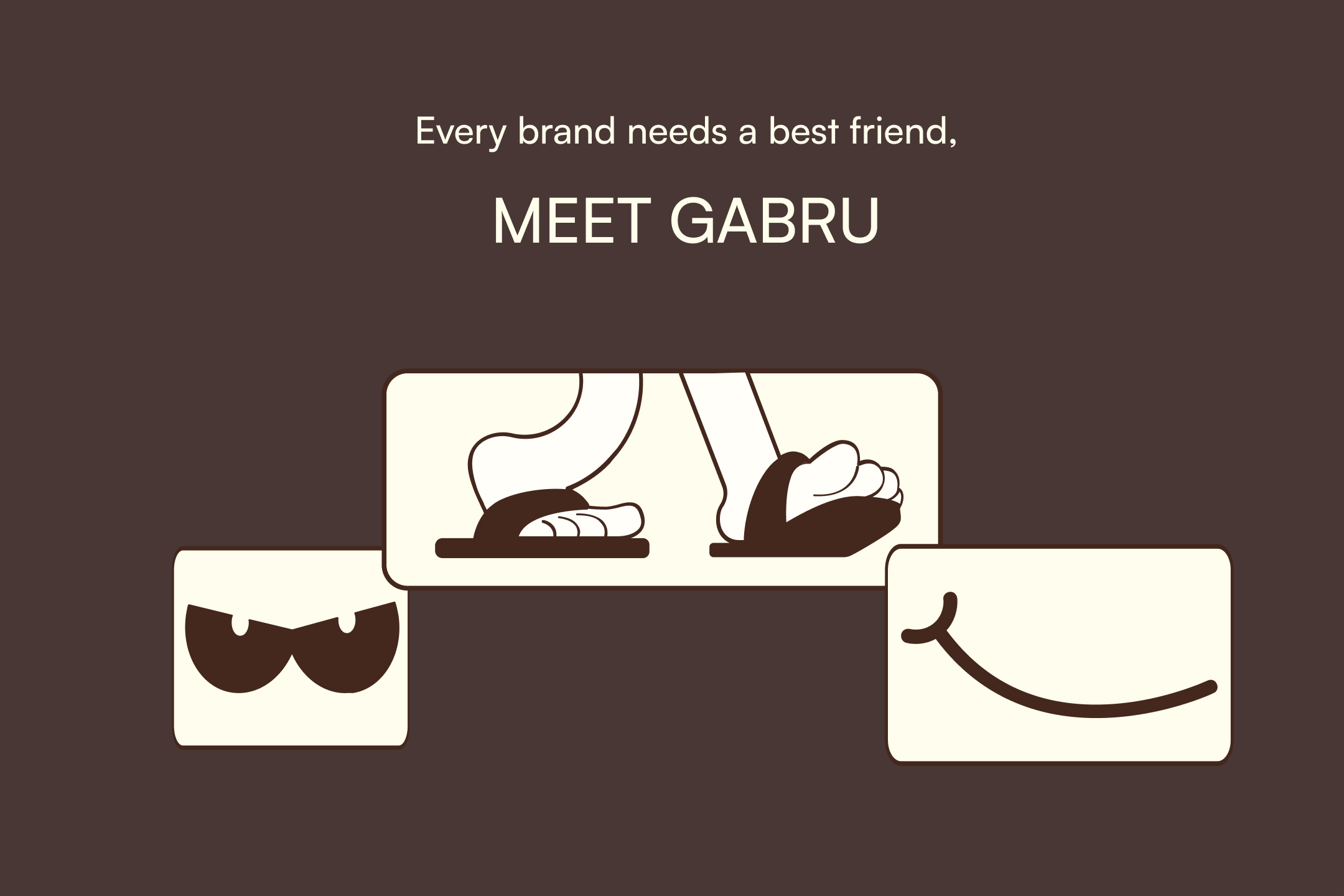
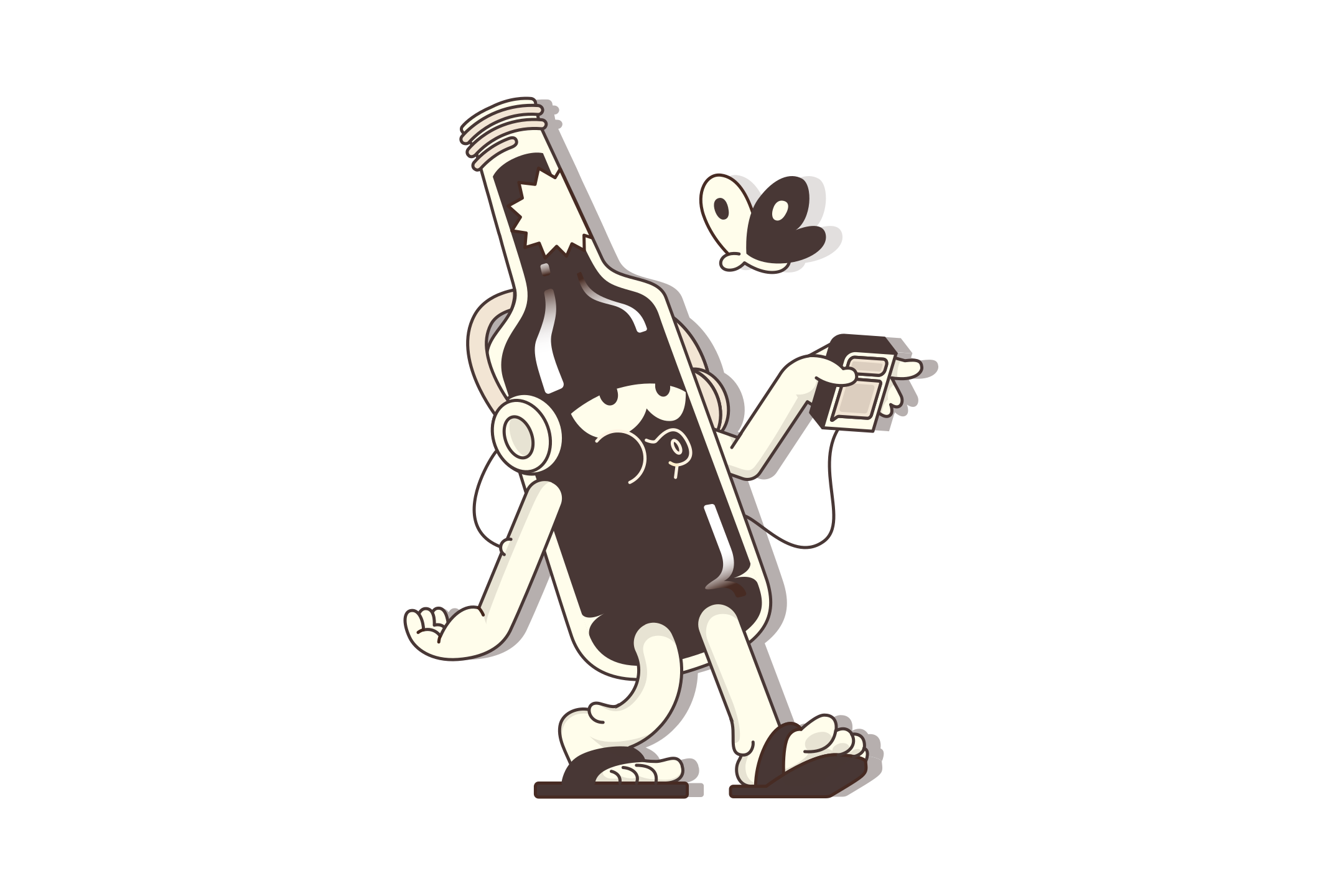
Most consumer brands spend considerable effort making their packaging recognisable. Theka already had an unusual and memorable bottle. By developing Gabru around that silhouette, we could connect two distinctive assets: the packaging and the character.
The mascot wasn't competing with the product for attention. He was reinforcing it.
Every time someone encountered Gabru on a poster, digital campaign, menu or piece of packaging, they also encountered a visual reference to Theka's bottle. This created a useful relationship between product recognition and brand recognition. It meant the identity could communicate personality while remaining anchored to something customers could physically buy. This is one of the reasons mascots can be powerful brand assets when designed strategically. They don't always need to introduce something new.
Sometimes, they can make an existing brand asset work harder.
This is where Gabru became particularly interesting. Theka wasn't selling just one cold coffee. Its product range included different strengths and flavours, each offering a distinct experience. For customers familiar with specialty coffee, these distinctions might be communicated through roast profiles, brewing terminology or tasting descriptions.
But Theka wasn't interested in making customers study coffee before choosing a bottle.
We wanted to communicate those differences through character.
Gabru's outfits, activities and expressions changed according to the flavour he represented. His eyes became an especially important part of this system, allowing us to communicate a wide range of emotions with minimal visual elements. Each variation gave the character a different personality while retaining the same recognisable body. This helped create a more intuitive way to distinguish products, including differences in coffee strength. Instead of relying exclusively on technical terminology, the brand could use visual storytelling to suggest what each variant was about.
The objective wasn't to remove product information: It was to make that information easier to approach. That distinction matters because accessible branding doesn't mean making a product less sophisticated.
It means reducing the effort required to understand it.
Gabru demonstrates a broader principle of brand identity design.
Visual characters can do more than represent a company. They can help organise how customers encounter and understand its products. A mascot's expressions, clothing, behaviour and surrounding visual environment can become part of a repeatable communication system. When those variations are consistent, they can help customers distinguish different products while recognising that they belong to the same brand. For Theka, Gabru's changing personality gave the coffee range an expressive visual language. The character remained familiar. What changed was the story he told.
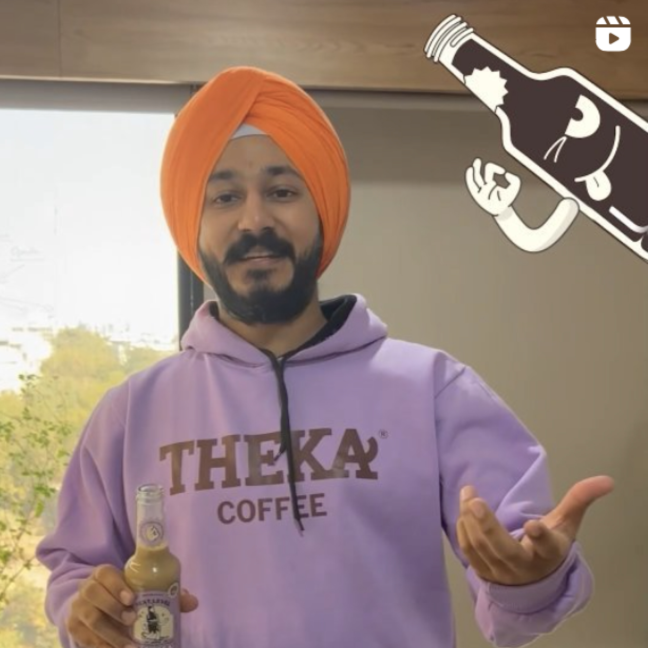
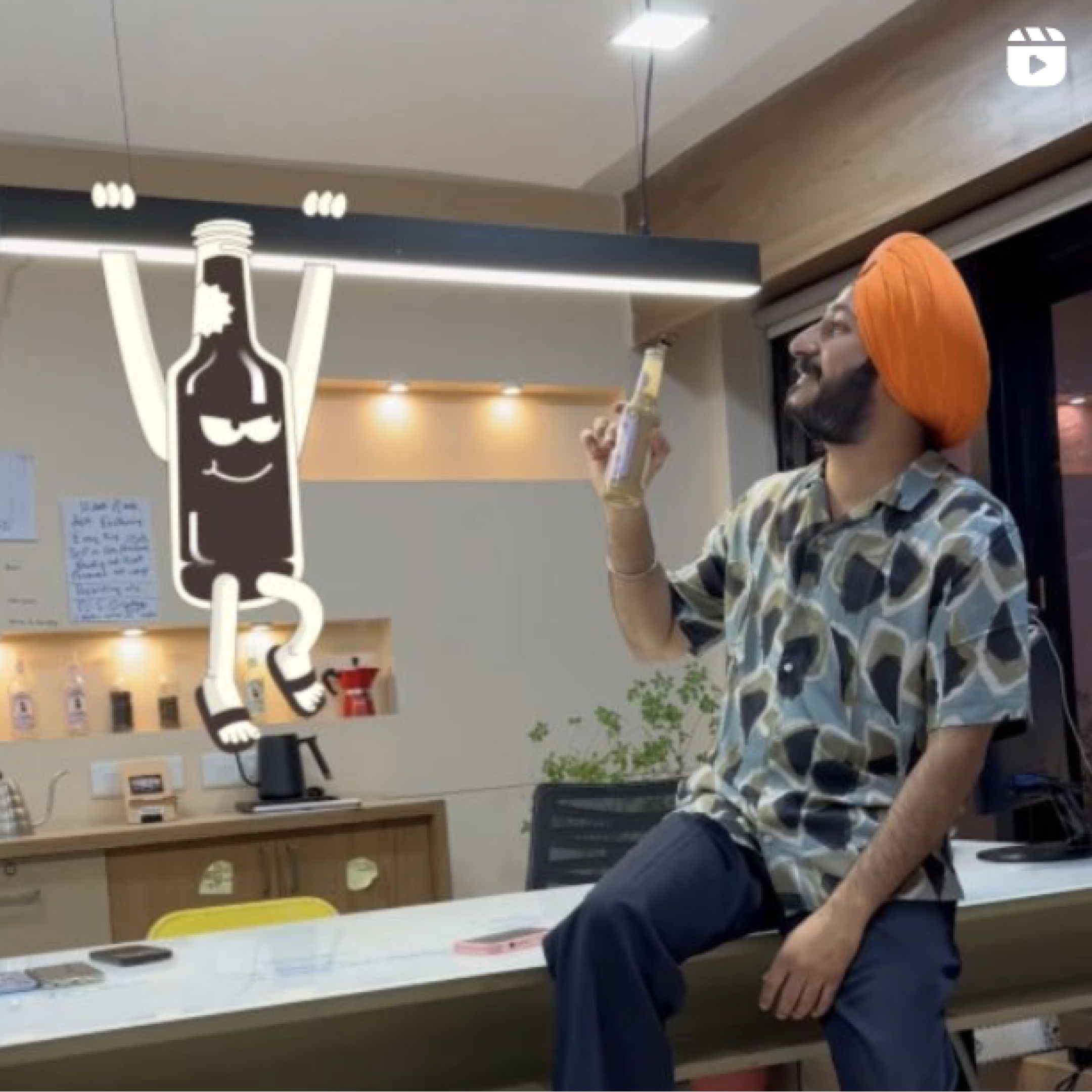
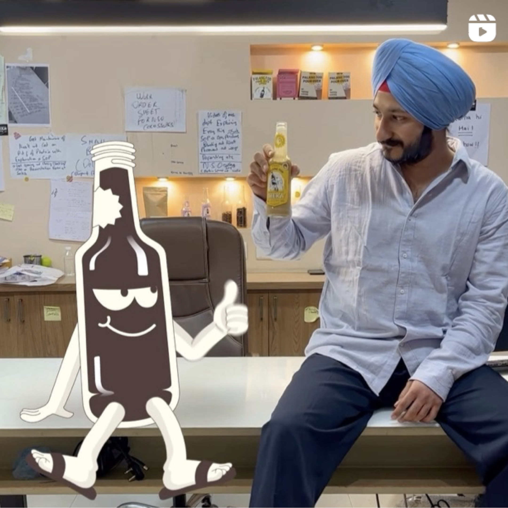
Mascots are often associated with children, confectionery, sporting events and mass-market products. But their strategic value is considerably broader. When developed around a genuine brand insight, a mascot can help a business achieve several things.
A character gives consumers another visual element they can associate with a brand.
The more consistently it appears across different touchpoints, the more opportunities consumers have to become familiar with it.
For Theka, Gabru's bottle-shaped body created a direct relationship between the mascot and the physical product.
People don't always make purchase decisions based on technical product knowledge.
Familiarity, personality and ease of understanding can also shape how comfortable a product feels.
Gabru gave Theka a culturally recognisable personality that aligned with the brand's accessible approach to specialty coffee.
A mascot can be adapted to represent different variants, occasions or product attributes.
Gabru's changing outfits and activities helped Theka communicate differences across its coffee range without depending entirely on specialist terminology.
A character can appear in different campaigns while remaining recognisable.
This becomes particularly useful when a brand needs to communicate through packaging, physical outlets, advertising, social media and digital experiences.
Logos are essential identifiers, but they aren't always expressive storytellers.
A well-developed character can communicate attitude, emotion and humour in ways that a static identity might struggle to achieve alone.
The important qualification is that a mascot isn't valuable simply because it's memorable or entertaining.
It becomes valuable when it performs a useful role within the brand system.
Gabru wasn't an accessory to Theka's identity.
He helped connect its product, personality and communication.
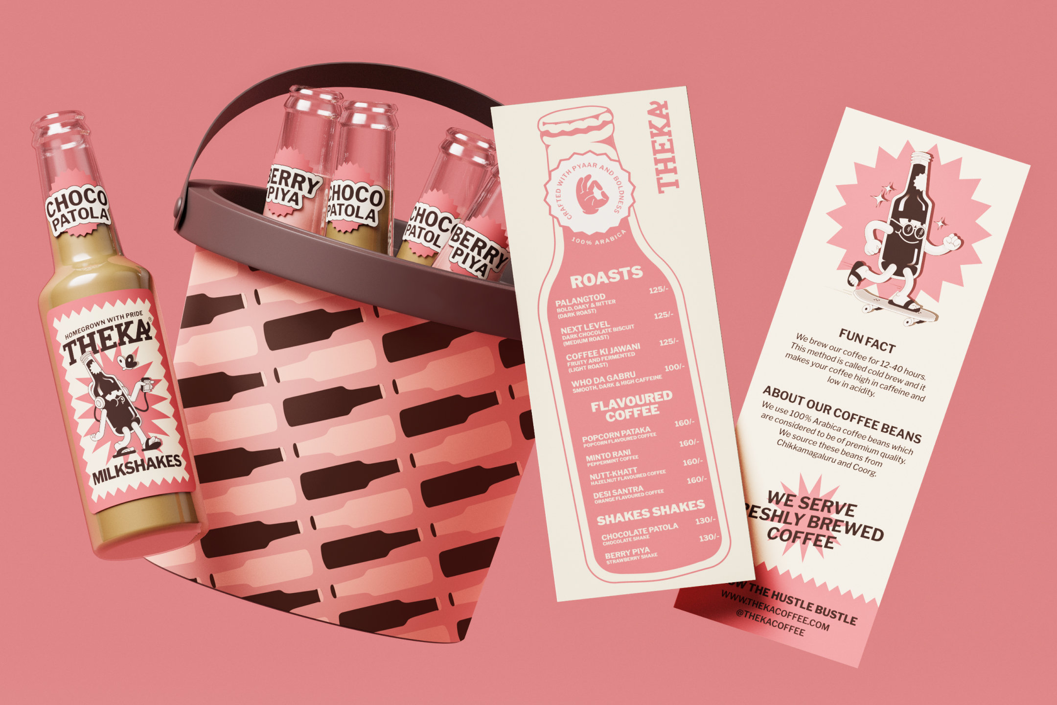
Gabru was one component of a much broader identity system. Our work for Theka included visual identity, illustration, packaging design, photography and connected brand experiences. The visual language took cues from the same personality that had made Theka distinctive in the first place. Bold colours, playful imagery, expressive illustrations and unconventional communication worked together to create a recognisable brand world.
The bottle remained central.
Its silhouette informed not only Gabru but also other elements, including the menu design. The identity extended into digital experiences, including Theka's website and app, along with campaign photography and marketing communication. For the rebrand campaign, we developed a film and photographs that expanded on the brand's lively, unconventional character. These were different expressions of one connected idea.
For a scaling business, that matters.
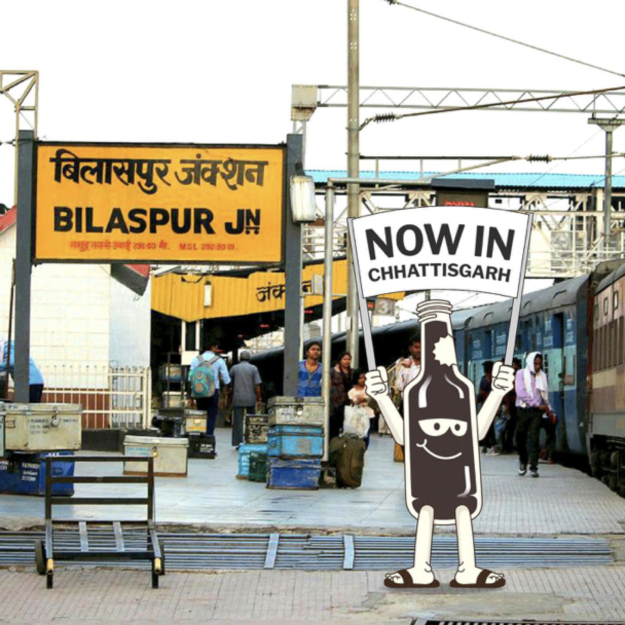
A customer might discover a brand through Instagram, encounter it at a kiosk, pick up its packaging and later see an advertisement announcing a new outlet in another city. Each experience should feel like part of the same brand. Consistency doesn't mean repeating the same layout everywhere. It means creating enough shared visual and verbal characteristics that the identity remains recognisable across different applications.
Theka's growth provides important context for understanding why the business needed a more developed brand identity. In January 2022, founder Bhupinder Madaan appeared on the first season of Shark Tank India. Although the business did not secure investment on the show, the exposure brought national attention and new opportunities. According to YourStory, Theka subsequently attracted funding and explored partnerships, including opportunities involving Reliance Retail. YourStory.com The company continued expanding its distribution and physical presence in the years that followed. Our published Studio Sorted case study documents a historical milestone of 200 outlets across more than 40 cities, alongside more than 10 lakh bottles sold in a reported year. Later reporting shows how far the business had expanded.
The rebrand gave Theka a more cohesive visual language, developed its existing assets and introduced a flexible mascot system.
It was designed to support three important business needs:
Theka's story offers several lessons for founders and marketing teams considering a rebrand.
Not every rebrand requires a new name, packaging format or personality.
Theka already had an unusual bottle, a memorable name and a distinctive way of speaking.
Those attributes became foundations for the refreshed identity, rather than things to discard.
Product sophistication and communication complexity are not the same thing.
A business can retain the substance of what makes its product special while communicating it in ways that are accessible to more people.
Gabru's role in distinguishing flavours and strengths illustrates how design can contribute to that process.
For growing businesses, an identity needs to be more than a collection of attractive individual executions.
It must work across the places customers encounter the brand.
A recognisable mascot, consistent packaging architecture and adaptable visual system give a business a stronger foundation for that consistency.
The needs of a brand operating in one city are different from those of a brand expanding nationally.
A successful rebrand must consider how the identity will function across future products, channels, markets and experiences.
This doesn't mean every scaling company needs a mascot.
It means every scaling company should understand which brand assets can help it become more recognisable, consistent and relevant as it grows.
Theka Coffee didn't become interesting because we gave it a mascot. The business already had a distinctive proposition, a compelling product and a personality people connected with. What we did was identify those strengths and build a more coherent system around them. Gabru became an important part of that work because he made the product itself expressive. He could communicate personality, help distinguish different coffees and appear across multiple brand experiences without losing his recognisable form. And he did it while wearing chappals. There is something wonderfully appropriate about that.
For a brand trying to make specialty coffee accessible to a broader Indian audience, the solution wasn't to make everything more sophisticated. It was to make the sophistication easier to understand.
Theka made specialty coffee accessible through its product and business model. The rebrand helped make that accessibility part of the brand's identity.
And Gabru gave it a face, a personality and quite a few expressions along the way.
Theka Coffee was rebranded by Studio Sorted in 2022. The project encompassed brand identity, illustration, packaging, photography and connected brand experiences.