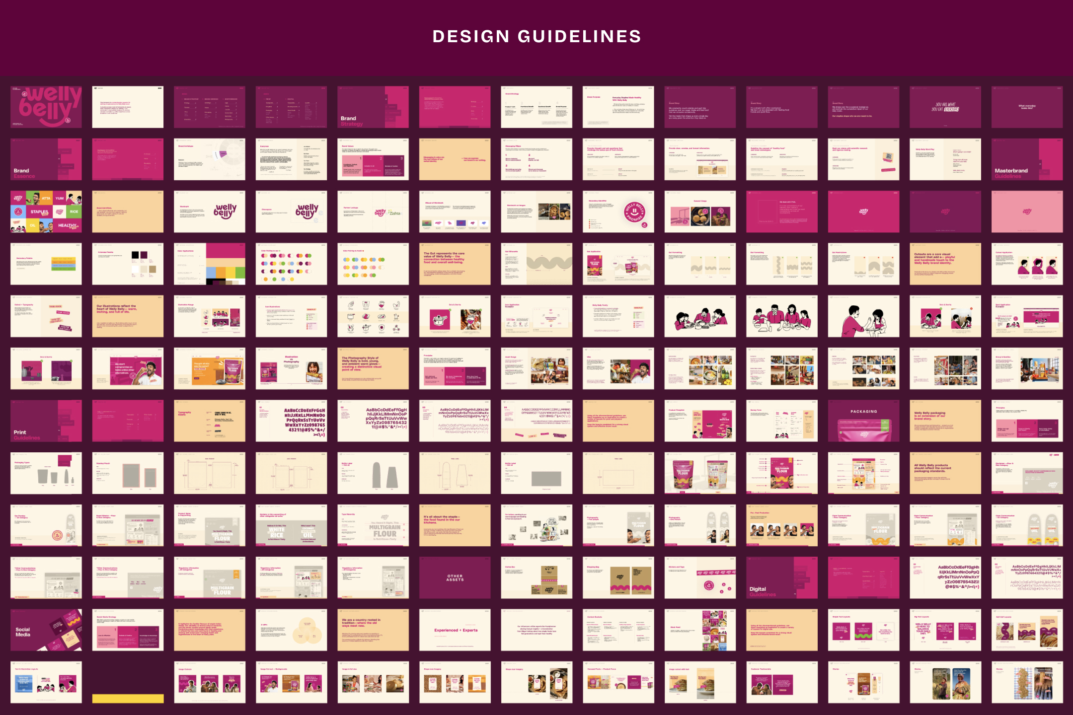
What even is a brand guide in 2025?
It’s no longer a PDF that gathers dust after the logo is approved.
A good brand guide today is your most practical brand tool.
It’s how your story stays consistent when your team grows.
It’s how your designer in Mumbai and your social media intern in Delhi stay on the same page.
It’s how you look sharp on a billboard, a bottle, or a browser tab - without needing approvals every time.
And if you’re building a brand that’s meant to scale, it’s the one non-negotiable that holds everything together.
In this blog, we break down what your brand guide should include in 2025.
Not just the basics - but the things most guides forget.
And yes, we’ll show you how we do it at Studio Sorted.
Every strong brand starts with why. Your brand guide should clearly articulate your reason for being—not just what you do, but why it matters. This section lays the foundation for everything that follows: messaging, tone, design, and decision-making.
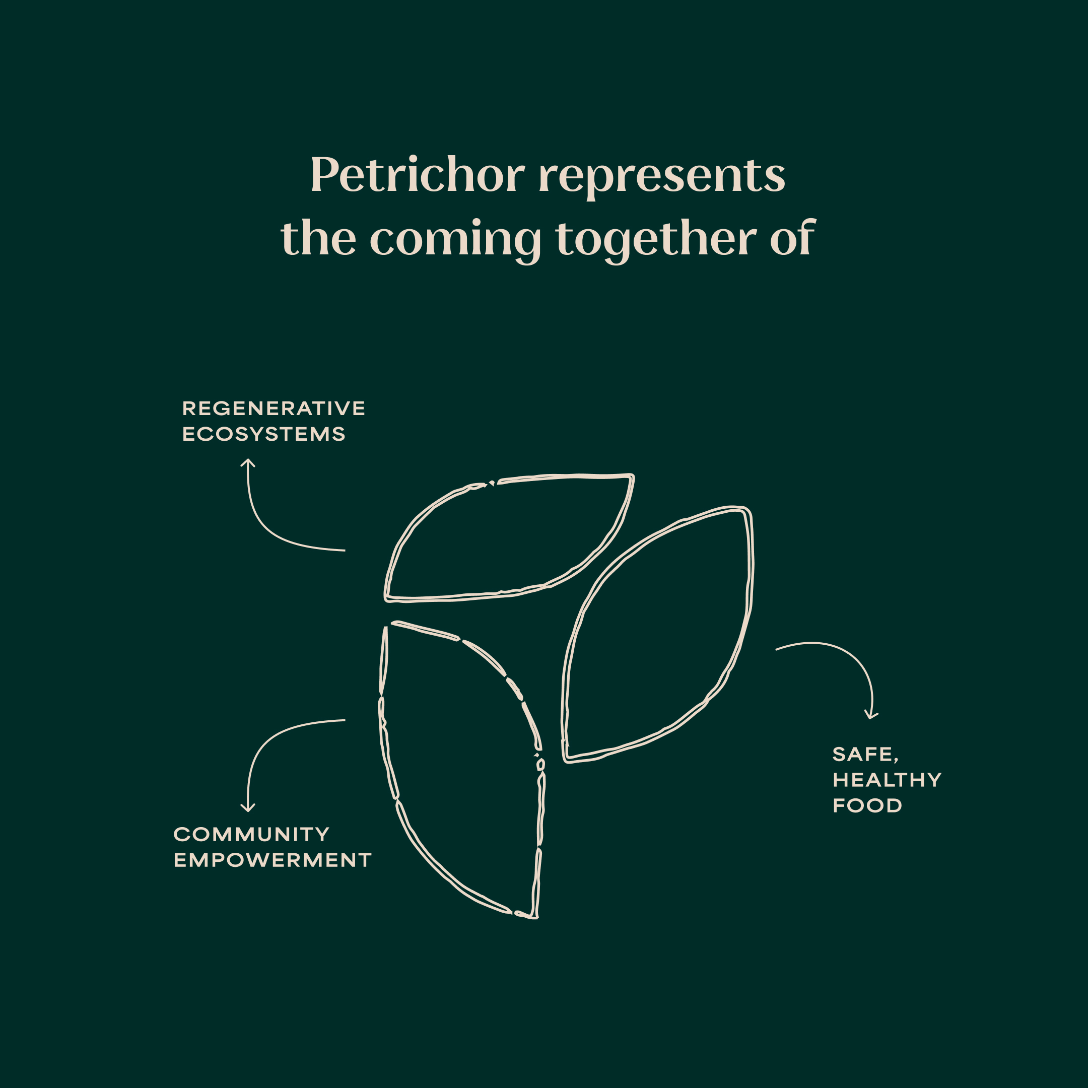
When your mission is clear, your brand becomes more than recognisable—it becomes meaningful.
Petrichor’s purpose diagram communicates its regenerative mission—bringing together ecosystems, community, and food to define a brand built for long-term impact.
Your brand’s core messages aren’t just slogans—they're memory hooks. These are the lines your audience remembers, quotes, and associates with your values. Your brand guide should list out your primary tagline, key product claims, and short phrases that form the backbone of your brand’s communication.
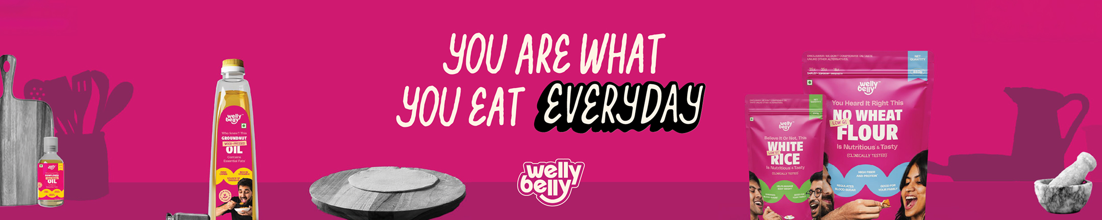
Welly Belly’s tagline “You are what you eat, everyday” reinforces their core promise: healthy food shouldn’t be the exception—it should be your everyday norm. Set against a bold pink backdrop, this statement appears consistently across packs, posters, and digital channels, anchoring the brand’s belief system in a simple, conversational phrase.
The best taglines aren’t just catchy. They’re carriers of your brand’s larger promise.
How do you sound when you speak to your audience? This section ensures your tone matches your brand's personality—everywhere.
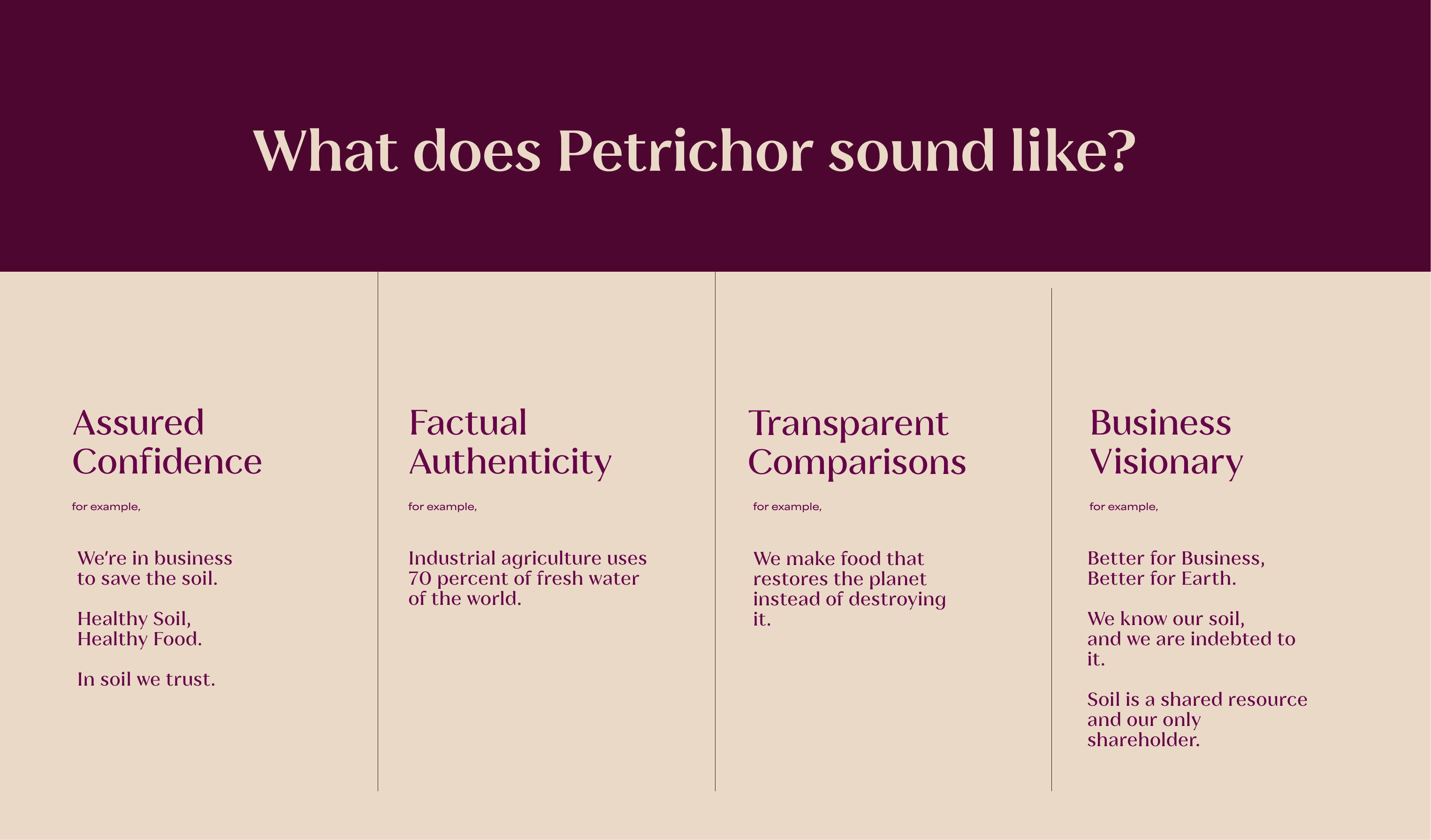
Petrichor’s tone doesn’t just communicate — it educates, advocates, and reassures. Their brand voice is a blend of assured confidence, transparent comparisons, and visionary thinking, grounded in factual authenticity. From phrases like “In soil we trust” to bold declarations about planetary restoration, the language system was built to reflect the regenerative mission of the brand. Each category of tone in the guide gives teams a precise understanding of how to communicate—whether on social media, packaging, or pitch decks—ensuring the brand’s voice stays as rooted as the soil it seeks to protect.
A good brand voice doesn’t just sound nice. It builds trust by being consistent, authentic, and unmistakably you.
A brand’s logo isn’t just a symbol — it’s a signature. But that signature loses its power when it’s misused. This section of your brand guide should outline how your logo can and cannot be used to preserve visual consistency and brand integrity.
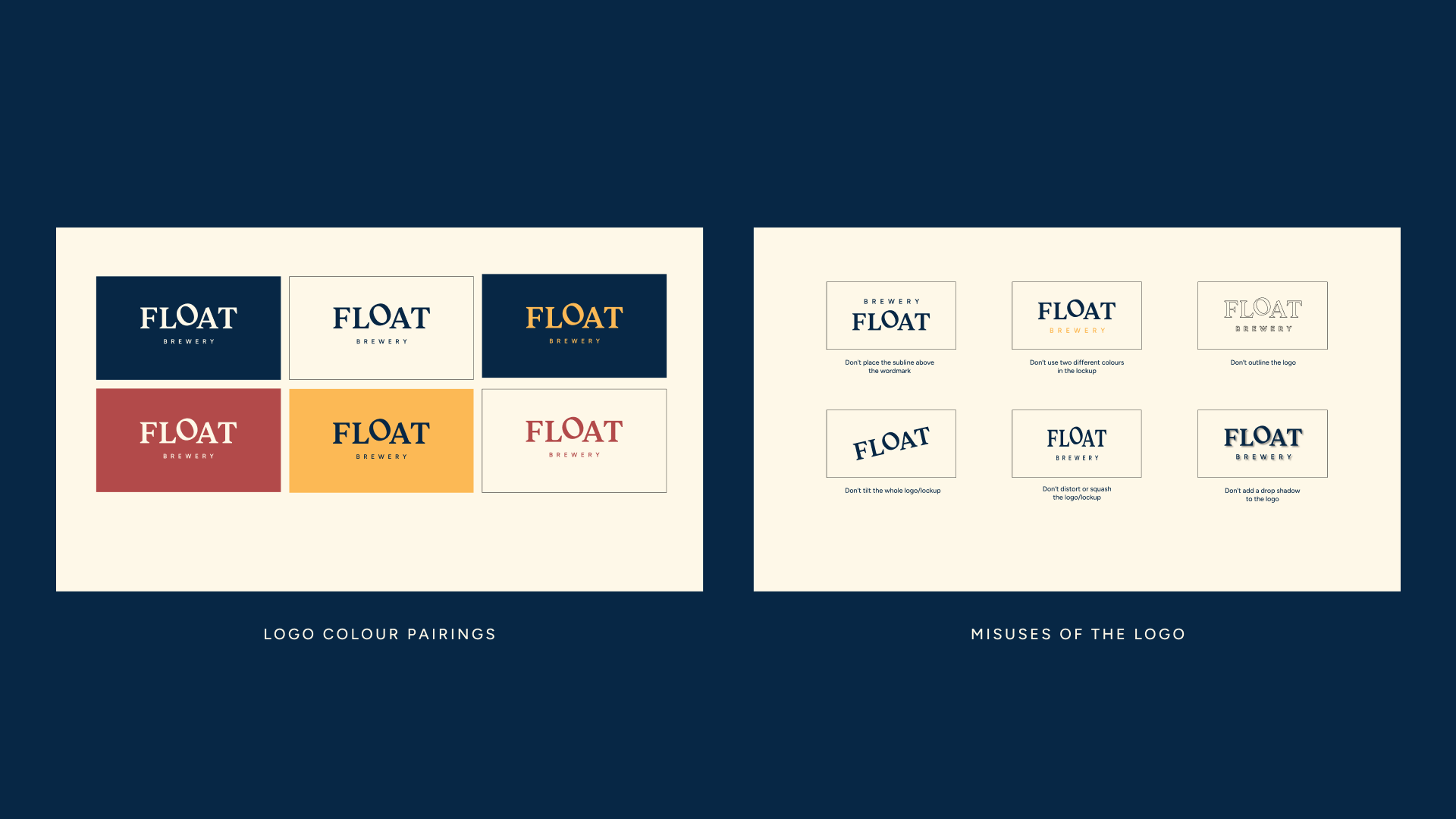
Protect your logo's integrity by defining its clear space, size, and misuse scenarios.
Take FLOAT Brewery for example. Their brand guide clearly demonstrates logo dos and don’ts — including how to pair colours, where the subline sits, and what distortions to avoid. These details become especially important as your brand scales across different touchpoints — from your Instagram profile picture to a 10-foot beer menu.
A good logo guide doesn’t just show the logo. It shows how to protect it.
Colour codes = brand memory. List your HEX, RGB, CMYK values, but also explain how to use them.
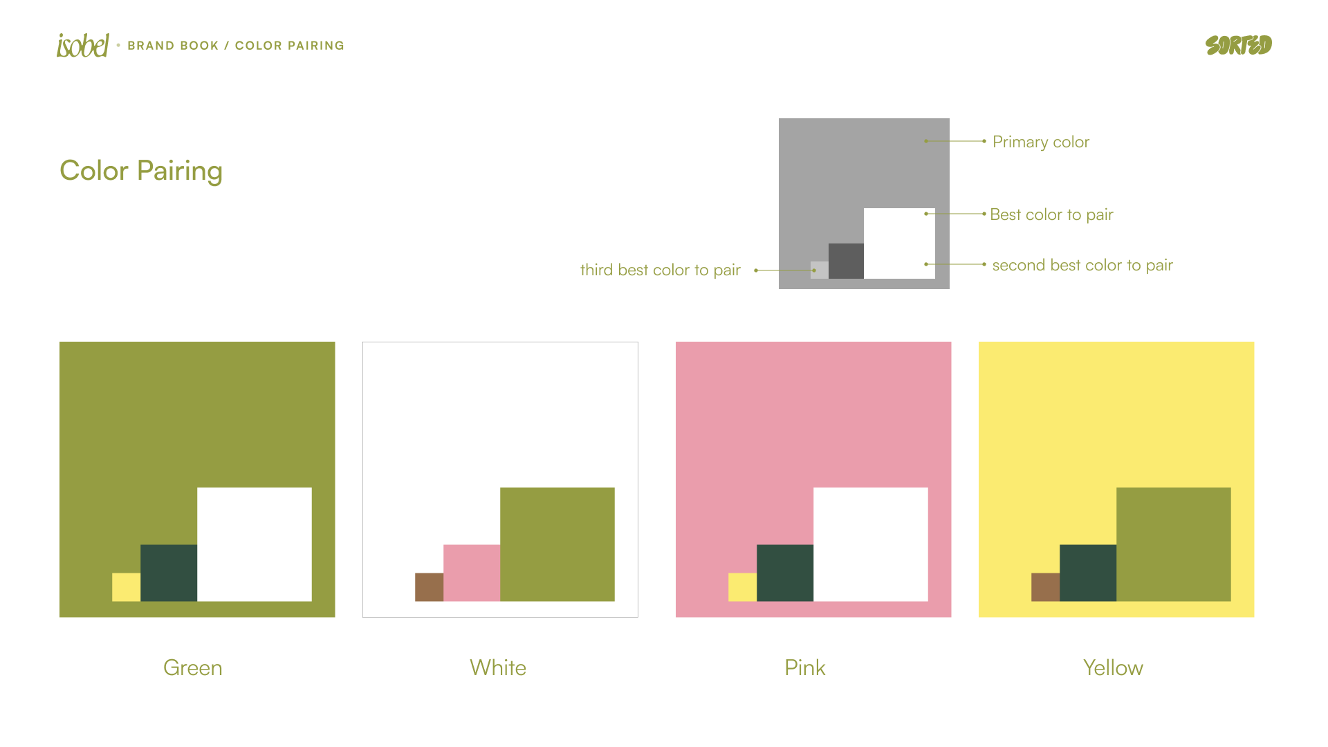
Colour becomes recall. Choose wisely, use consistently.
Isobel’s colour palette is built around warmth, softness, and quiet confidence. The muted white, greens, and dusty pinks mirror the slow mornings and tender rituals the café invites. But this isn’t just aesthetic, it’s applied with care across everything: from Instagram posts to the colour of their takeaway cups, from staff uniforms to the signage at both their Jayanagar and Lavelle Road locations. The palette doesn’t shout, but it leaves a lasting impression, one warm sip at a time.
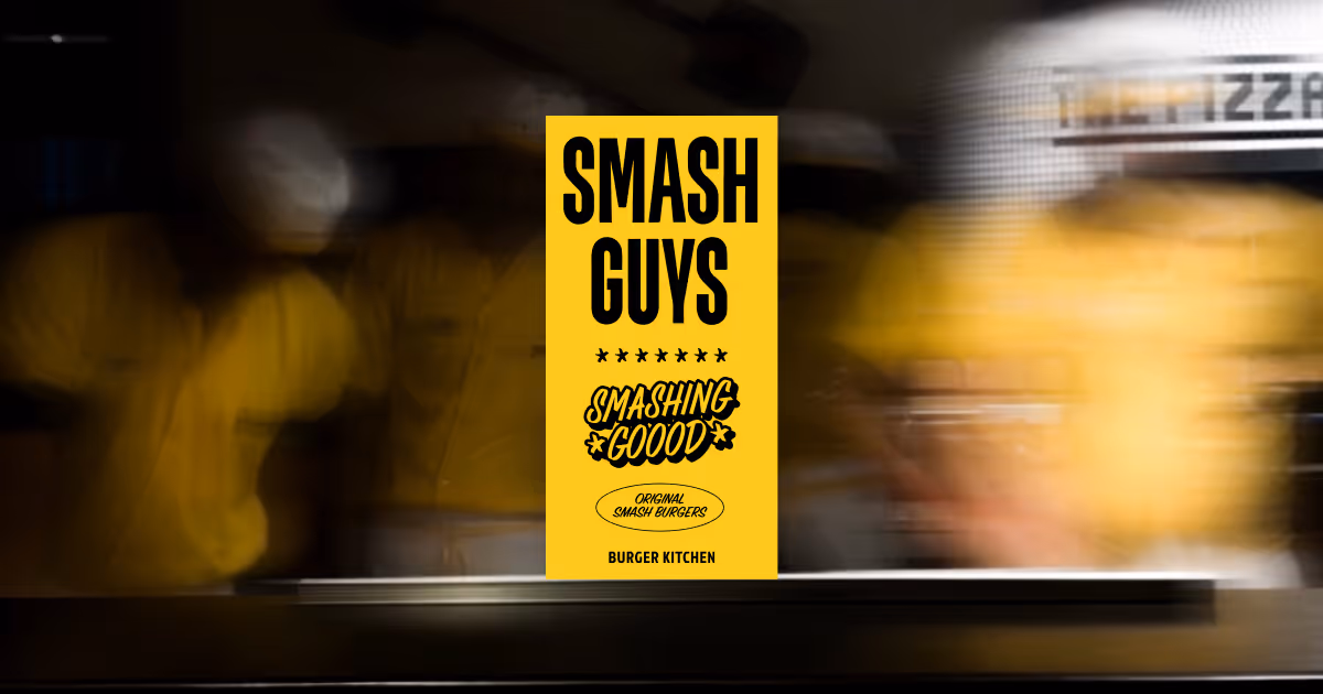
Fonts shape your brand’s personality. This section defines which fonts to use, when, and how.
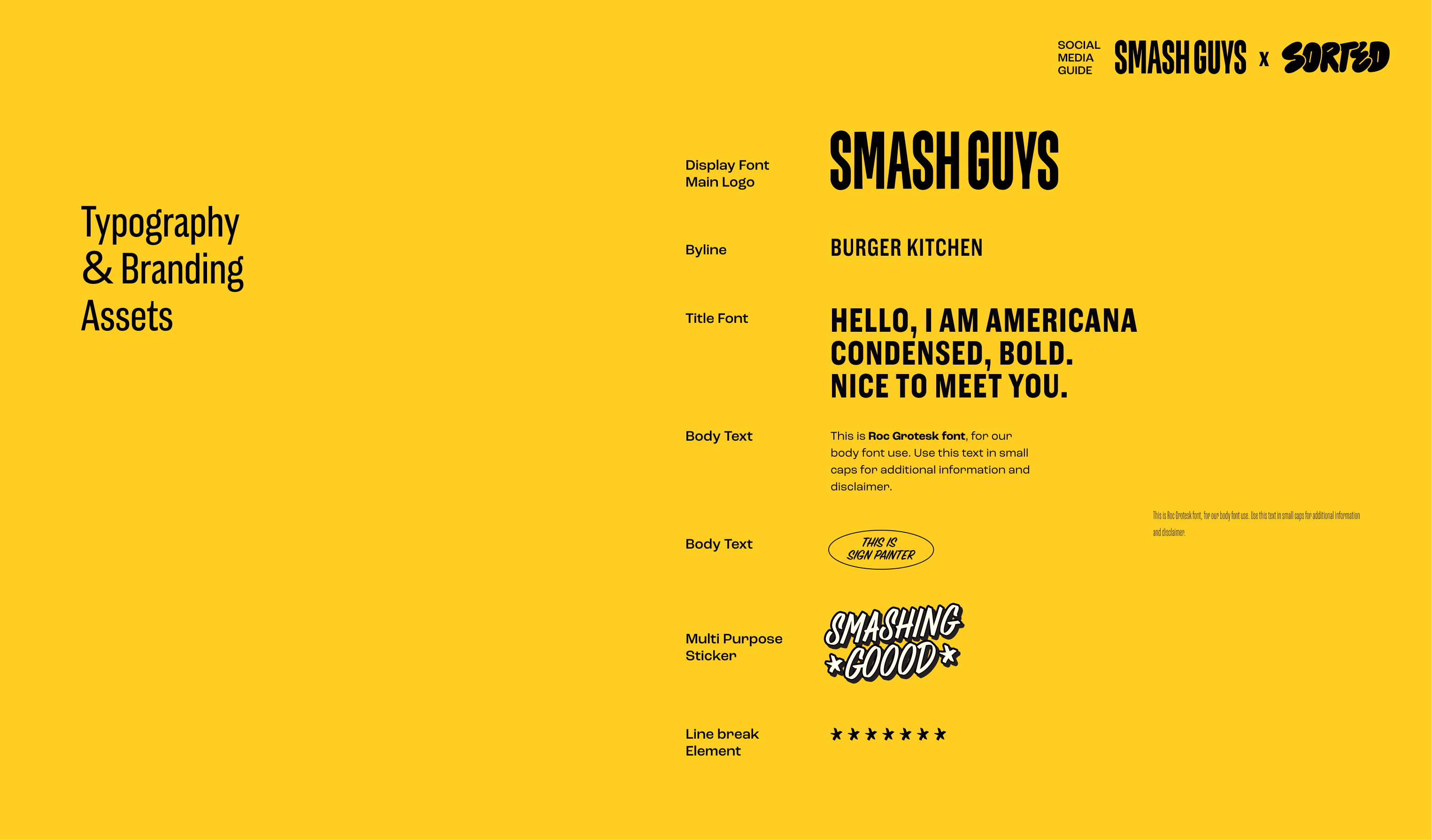
Whether you're using sleek sans-serifs or playful display type, the type system ensures consistency across your pitch decks, app UI, and packaging.
Smash Guys uses typography like it uses flavour — bold, unmissable, and straight to the point. The brand guide breaks down exactly which font to use where: from storefront menus to Instagram captions to the tiny legal disclaimers on packaging. This level of clarity helps every touchpoint feel like it’s coming from the same voice — loud, cheeky, and unmistakably Smash. When your fonts are defined with hierarchy and purpose, you don’t just look better — you sound sharper too.
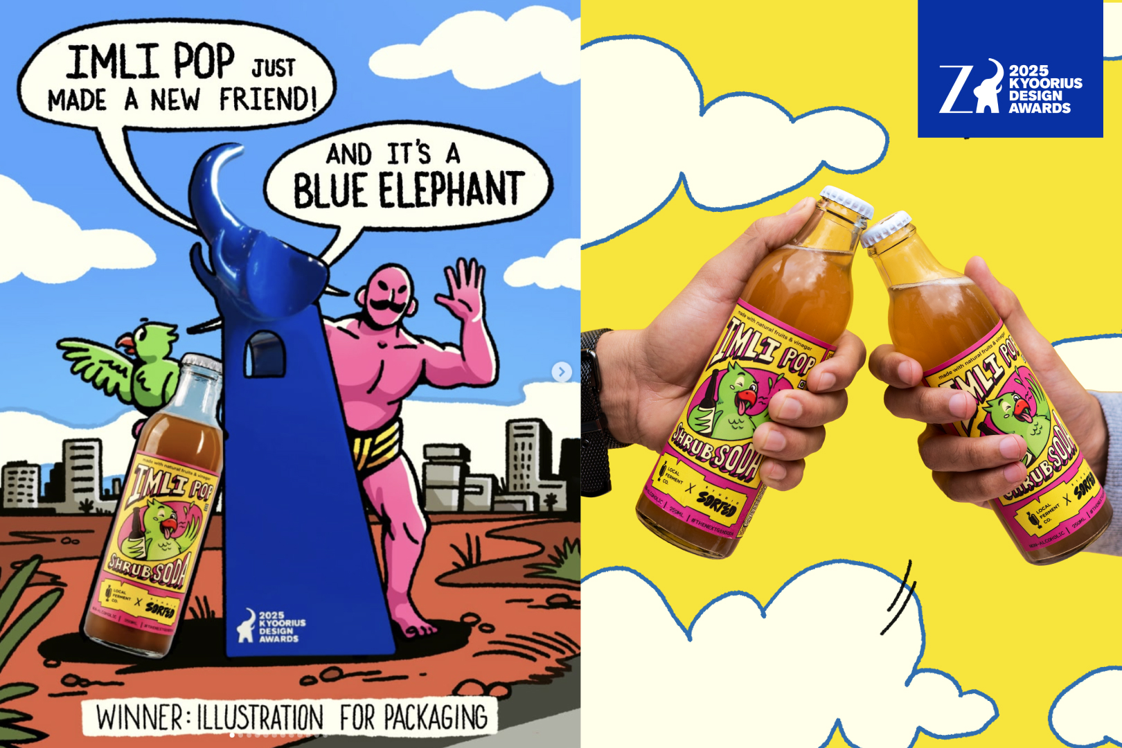
Photography, icons, illustrations—all of these bring your brand to life. Your guide should define the rules of visual tone.
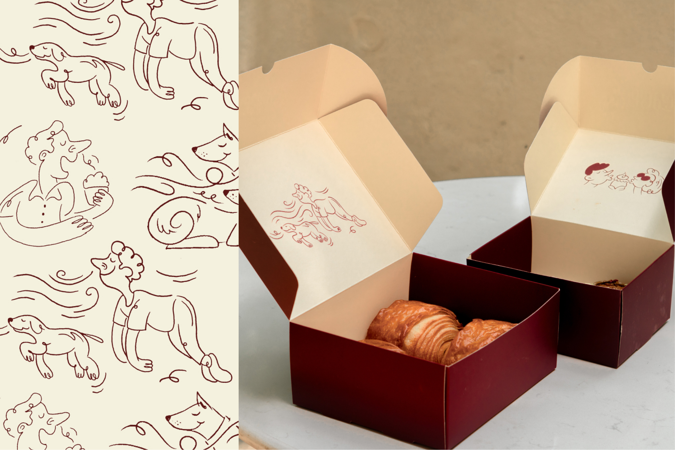
Juny’s took the scent of fresh Iyengar bakery treats and turned it into an emotion-led graphic system. The result? Customers mirrored the illustrations when they received their orders.
Your brand's "design DNA." Layout grids, icon styles, patterns, and signature elements that repeat across formats.
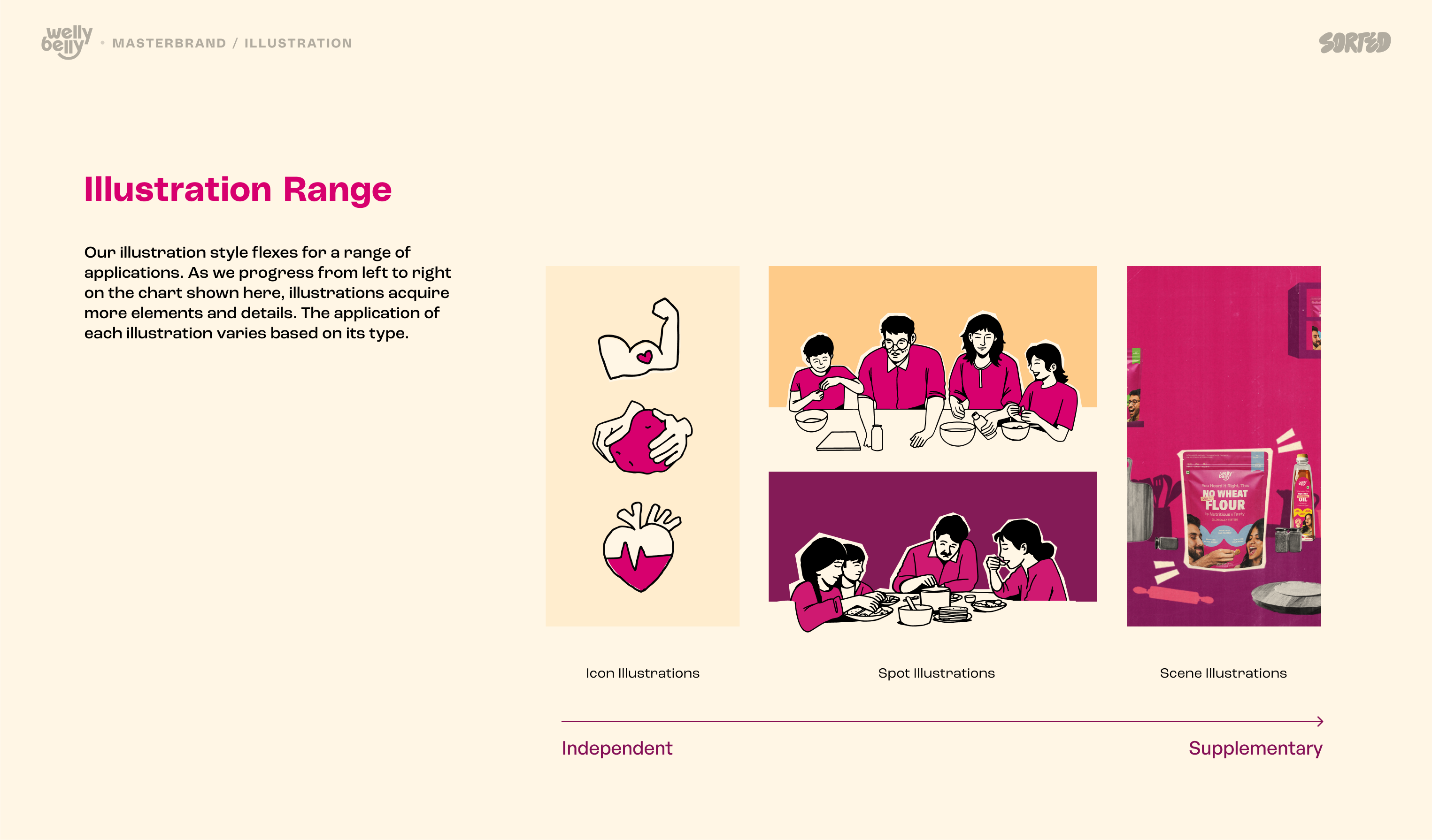
Welly Belly’s illustration system wasn’t just decoration—it was designed with a purpose. The brand uses a tiered visual language that moves from iconic to immersive: starting with strong, standalone icons (like the gut or heart), progressing to character-led spot illustrations, and culminating in rich, scene-based visuals for packaging and marketing. This system allowed for flexibility across mediums while staying instantly recognizable. Whether it’s a billboard, website, or back-of-pack moment, the illustration always lands with emotional resonance and graphic clarity.
Show your brand in the wild. Mockups and real-life use cases build confidence and inspire action.
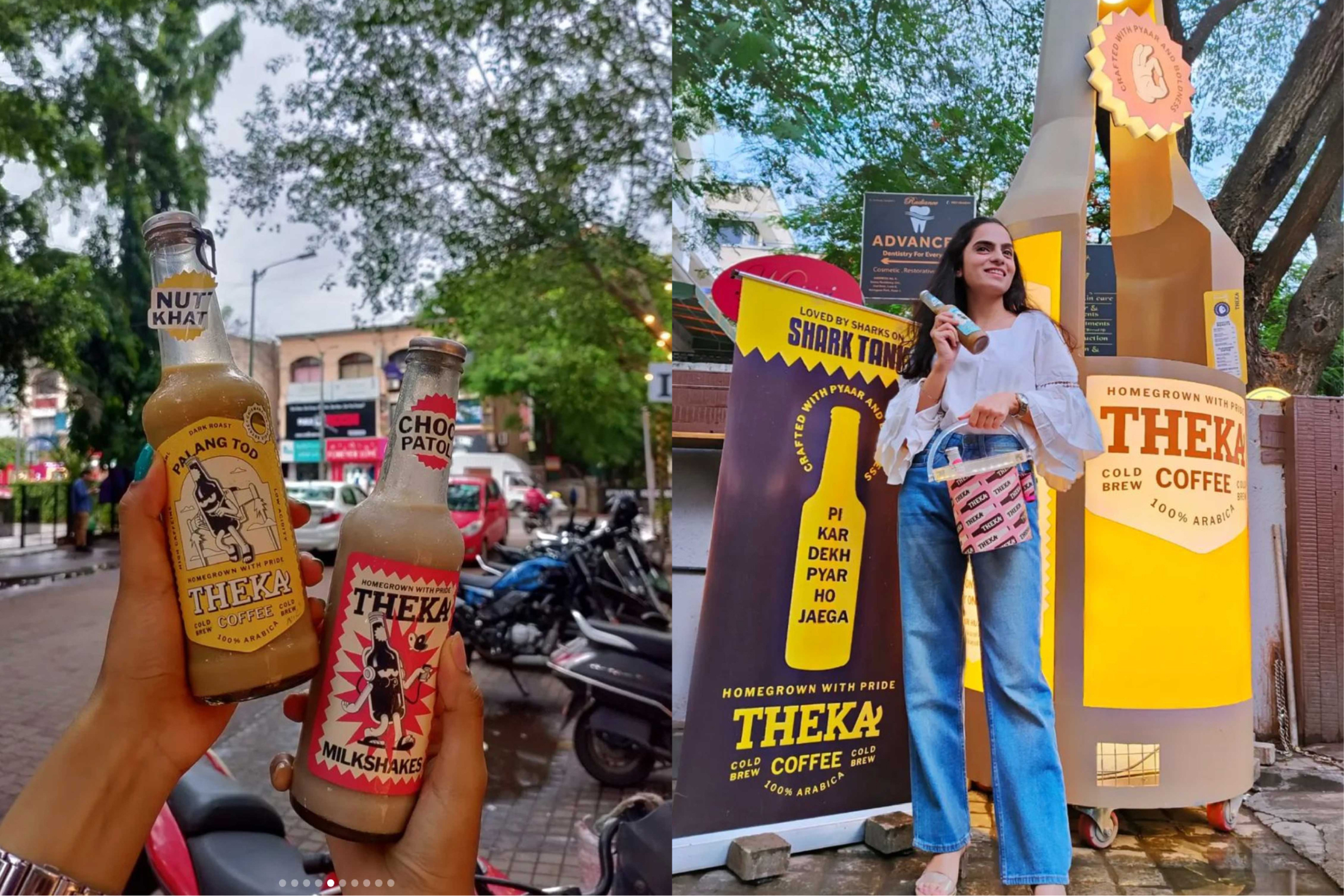
When we rebranded Theka Coffee, it wasn’t just about giving the bottle a new look. We crafted a visual and verbal system that could scale—from beer bottle packaging and cheeky drink names, to giant product installations and on-ground activations. The mascot Gabru, witty Desi copywriting, and bold design extended into every touchpoint, from Shark Tank showcases to merchandise and signage.
The result? A cold coffee brand with street-level charm and national credibility—built with consistency, energy, and unmistakable recall.
When your brand shows up everywhere, and still feels like one brand—that’s when it sticks.
Most of your audience sees your brand here first. Treat social as a key branding channel, not an afterthought.

For Bad Apple, we built a content system that balances flexibility with familiarity. The guide doesn’t just show what fonts or tones to use—it outlines reusable layouts, logo applications, and visual masks that turn every post into a branded experience. From story campaigns to product drops, this system keeps their presence recognisable even as the content evolves.
Social isn’t just a marketing channel. It’s your loudest brand voice.
Your brand guide isn’t just a document: it’s your culture, creativity, and consistency, all rolled into one.
If you’re building your brand from scratch or scaling with a new team, this checklist will help you build the right foundation.
Looking to create a guide that scales with your vision? Let’s talk. studiosorted.com/contact