If branding is how you show up, packaging is how you start the conversation.
It’s your product’s first impression—on the shelf, in a supermarket scroll, in a friend’s fridge. And in less than 3 seconds, it decides whether someone picks you or passes you by.
At Studio Sorted, we’ve spent years building brands across food & beverage, hospitality, and culture. From cold coffee in glass beerbottles (Theka Coffee) to gut-friendly staples (Welly Belly) and nostalgic tamarind soda (Imli Pop)—packaging isn’t a layer we add at the end. It’s central to how we build brands.
This blog breaks down 8 key principles from our talk with the WTF Insiders Community, Pack to the Future—a playbook for founders, marketers, and designers who want their packaging to do more than just “look good.”
Great packaging captures the emotional win. What’s the delight in using your product? That’s what the design should amplify.
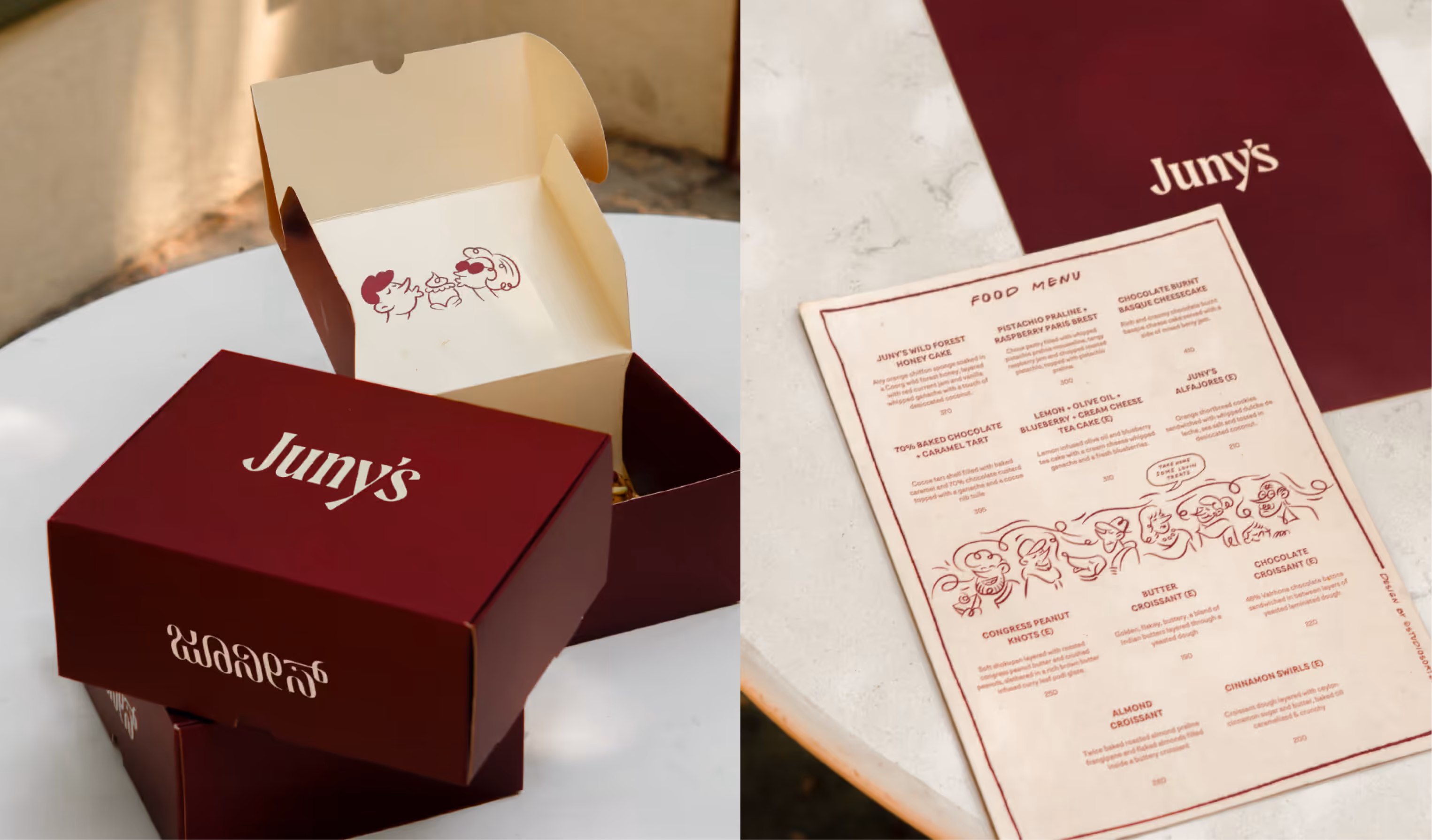
Take Juny’s for example! Here, the joy was entirely in the senses.
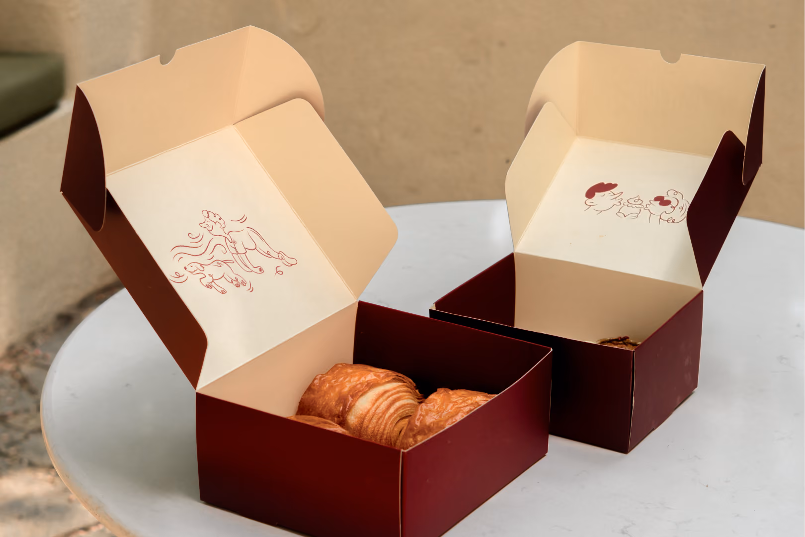
In Bangalore, there’s a specific kind of nostalgia that lives in the smell of fresh bakes. On street corners and near every Iyengar bakery, the aroma pulls entire neighbourhoods in. That memory, that moment was central to what Juny’s stood for.
Founder Ria’s vision was rooted in her own Bangalore upbringing, where baked goods weren’t just food, they were a shared experience. An ode to her childhood, her home, and that unmistakable scent became the creative north star for the brand’s identity.
We designed packaging that captured that sensory hit. Playful line illustrations of characters with their noses up: literally following the scent, became the emotional hook. And it worked. We even saw people posing with the boxes, mimicking the same expressions. The packaging didn’t just deliver joy-it mirrored it.
Ask yourself: What moment of delight is this product unlocking?
How do I turn that into packaging shorthand?
Packaging is the tightest version of your brand story. Every surface matters. From the name and claims to certifications, icons, and product hierarchy—it all needs to ladder up to a single narrative.
Our structure often follows the StoryBrand Framework: the customer is the hero, the product is the guide, and clarity wins.
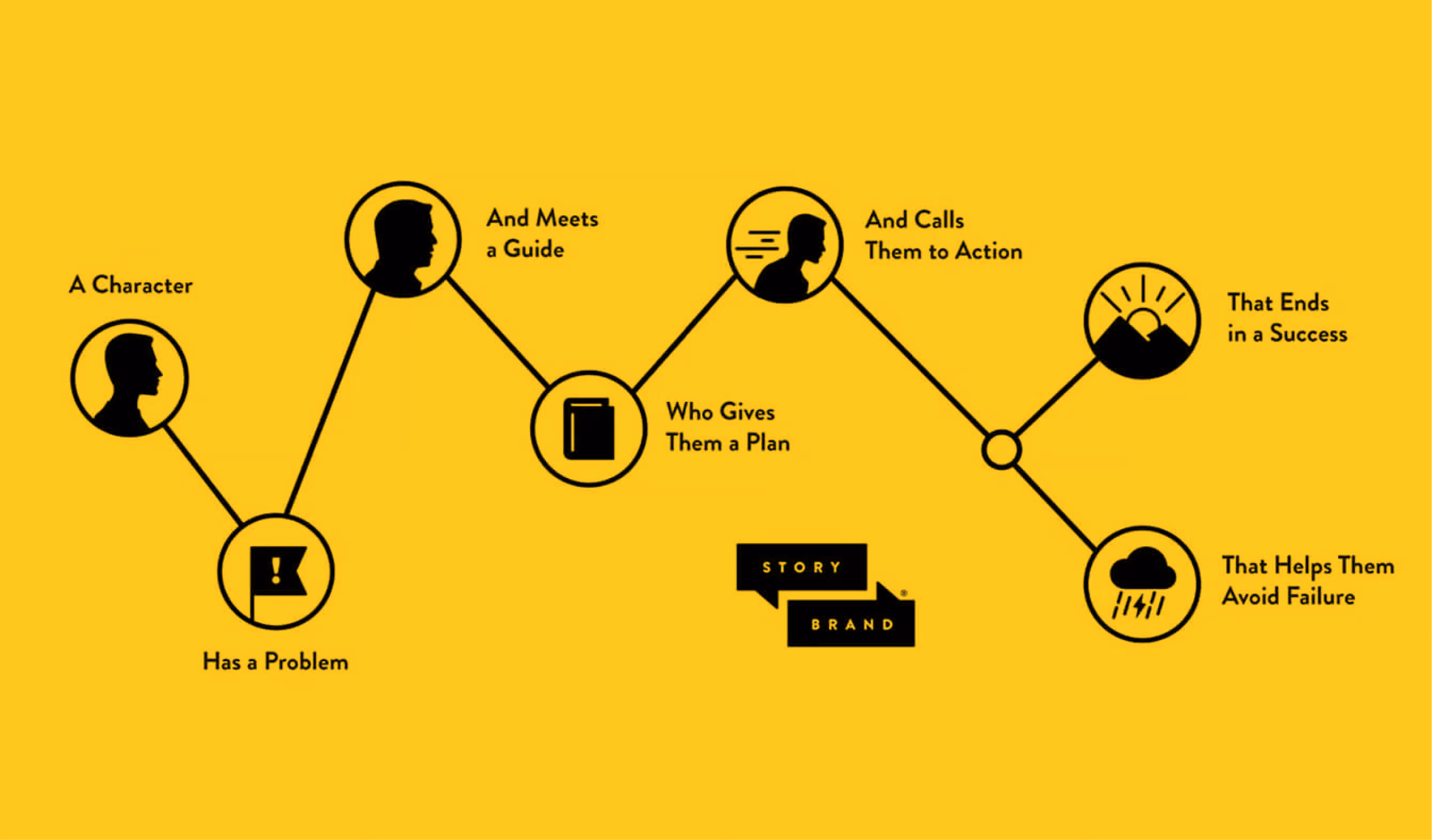
Here's how Welly Belly's packaging plays a supporting role in solving the customer’s problem.
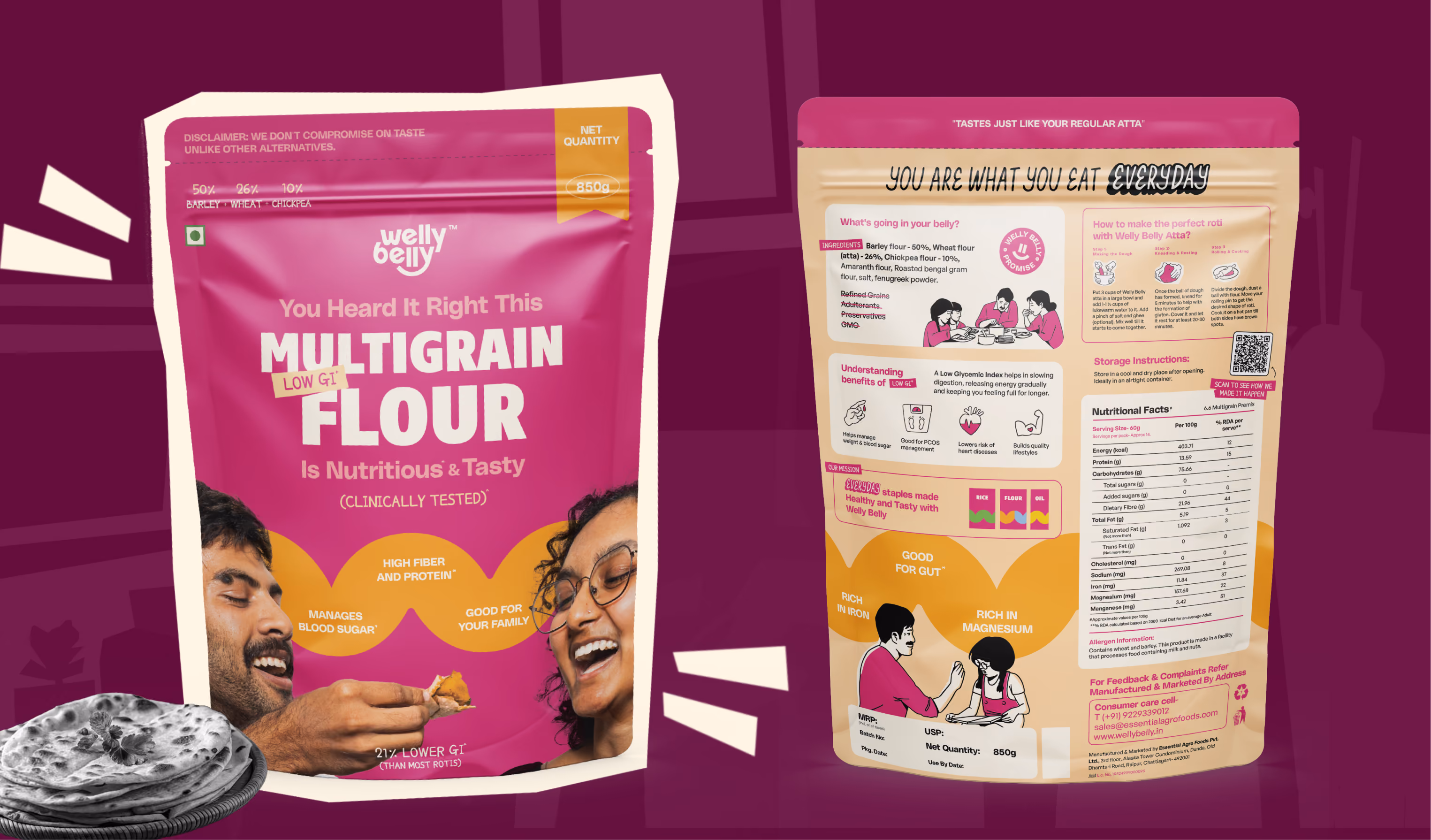
The hero of this story is the health-conscious Indian consumer, someone who wants to eat well every day, but is tired of being forced to choose between taste and nutrition. They’re navigating grocery aisles filled with dull, preachy, and clinical packaging. They want food that supports their gut and fits their lifestyle, without feeling like a punishment.
The problem is emotional and cultural: most healthy staples are branded like medicine.
The colours are muted. The claims are preachy. And they reinforce the idea that eating healthy = compromise.
These customers want to feel good about their choices, not judged by them.
Enter Welly Belly—a brand that understands this tension and doesn’t ask them to choose.
Welly Belly positions itself not as the expert preaching nutrition, but as the guide making gut-friendly food joyful and accessible. The brand understands the consumer’s lifestyle and wants them to feel better and eat better.
Welly Belly’s plan is simple:
The packaging becomes a key part of this plan. It communicates joy with unapologetic pink blocks, bold typography, and a tone that feels fresh and modern—not moralistic. The clean label system keeps things honest, while the colour makes it easy to spot (and love) on shelves.
Welly Belly invites its customers to reclaim their plate.
Instead of avoiding the grocery aisle for health foods, they’re encouraged to embrace it.
The bold visual language serves as a nudge-this is healthy, and you’ll actually enjoy it.
The CTA is unspoken but strong: pick this, and you won’t regret it.
By choosing Welly Belly, the customer avoids the disappointment of bland, guilt-inducing health foods.
They no longer have to settle for wellness products that look and feel like supplements.
They avoid falling back into eating choices that hurt their gut or ignore their health goals.
Success here is simple and powerful:
Result? They’ve discovered a brand that aligns with their values, lifestyle, and personality. And that emotional connection begins right at the packaging.
Think in story arcs.
Don’t just decorate, communicate.
Raymond Loewy’s MAYA principle (Most Advanced Yet Acceptable) explains why great design sits right at the edge of newness.
We don’t trust things that look too unfamiliar. We don’t notice things that look too expected. The balance is the magic.
For deeper context, watch this TED Talk or this breakdown.
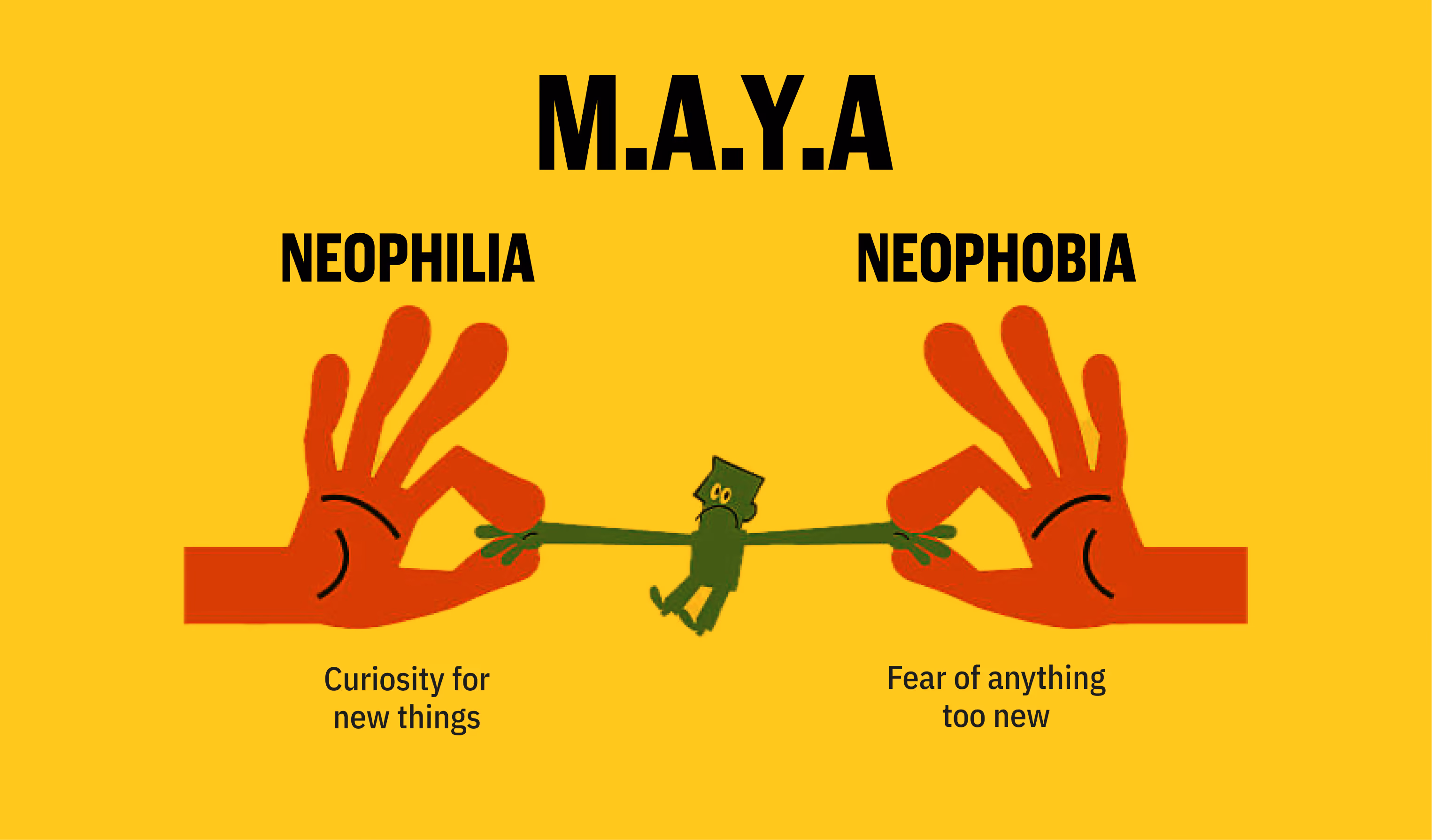
Rebrands aren’t about starting over. They’re about evolving without losing what made people care in the first place. That’s where MAYA: Most Advanced Yet Acceptable, becomes crucial.
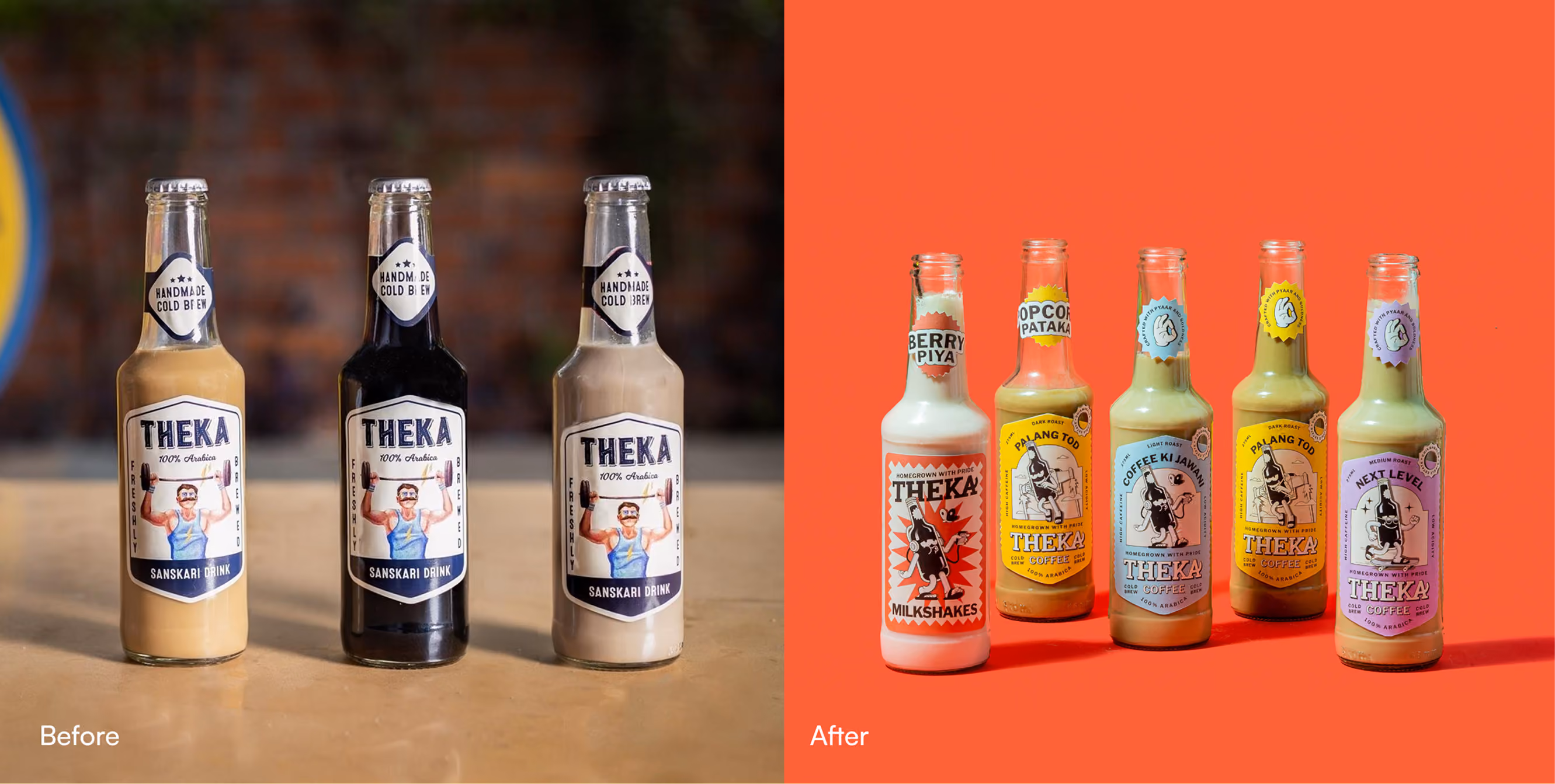
When we began rebranding Theka, the goal wasn’t to reinvent the product. The product was already loved.
Theka had found success with street-style cold coffee served in beer bottles. Its Hindi-inspired naming, desi flair, and affordability made it instantly accessible, especially to customers who didn’t see themselves in the barista world of espresso shots and specialty jargon.
After appearing on Shark Tank, Theka had national visibility. But it didn’t have a visual identity that could scale. The brand didn’t look legitimate enough to build trust across cities, franchise owners, or mainstream retail. That’s where the rebrand had to thread the needle.
Gabru didn’t replace Theka’s charm. He amplified it. He made the energy tangible, bridging the raw edge of the street with the trustworthiness needed to scale.
In a rebrand, change isn't about moving forward fast—it’s about moving forward without losing your people.
MAYA reminds us to listen to what worked, protect what mattered, and evolve what’s necessary.
Sometimes it’s not about fitting in. It’s about flipping expectations.
But packaging disruption is high risk. Remember Crystal Pepsi? It was a transparent soda that no one trusted. Or Tropicana’s rebrand in 2009 that tanked sales by removing the familiar orange-with-straw.
Change is great, but it backfires by abandoning recognizable elements that consumers had emotional connections with: both tangible and intangible.
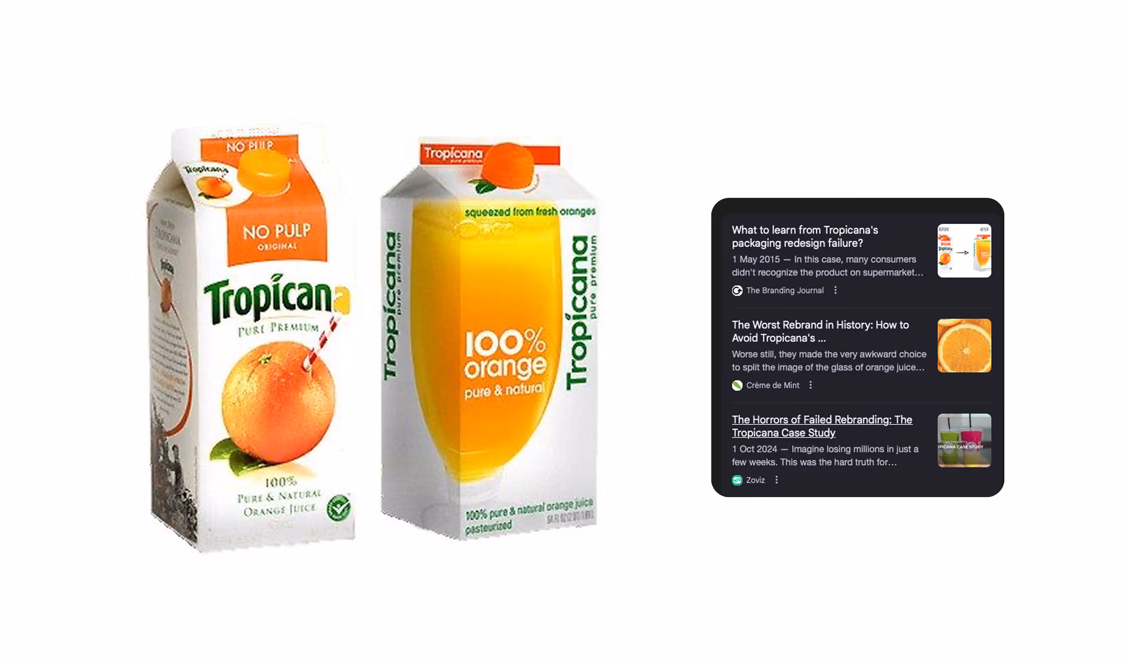
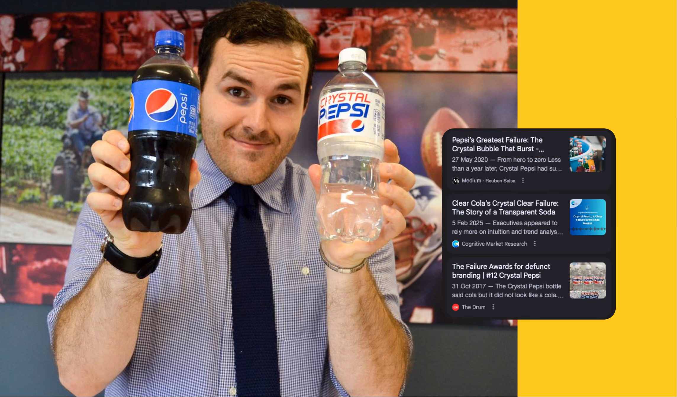
To sell something familiar, you must make it surprising, and to sell something surprising, your must make it familiar.
Not every design needs to shout. In fact, the best ones often whisper, quietly guiding the eye without distracting from the product.
Consumers only spend 3 to 7 seconds on average looking at the front of a pack. And the first thing they see? Usually the top third and center-left.
This is where layout, typography, and subtle print finishes play a crucial role. Whether it’s gloss vs matte texture or the placement of your core claim, these choices tell the user where to look and what to feel—without them ever realising it.
Everybody LOVES an upgrade but no one wants a shock.
Trying to please everyone leads to forgettable design. Instead, zero in on your bullseye audience—and make them feel seen.
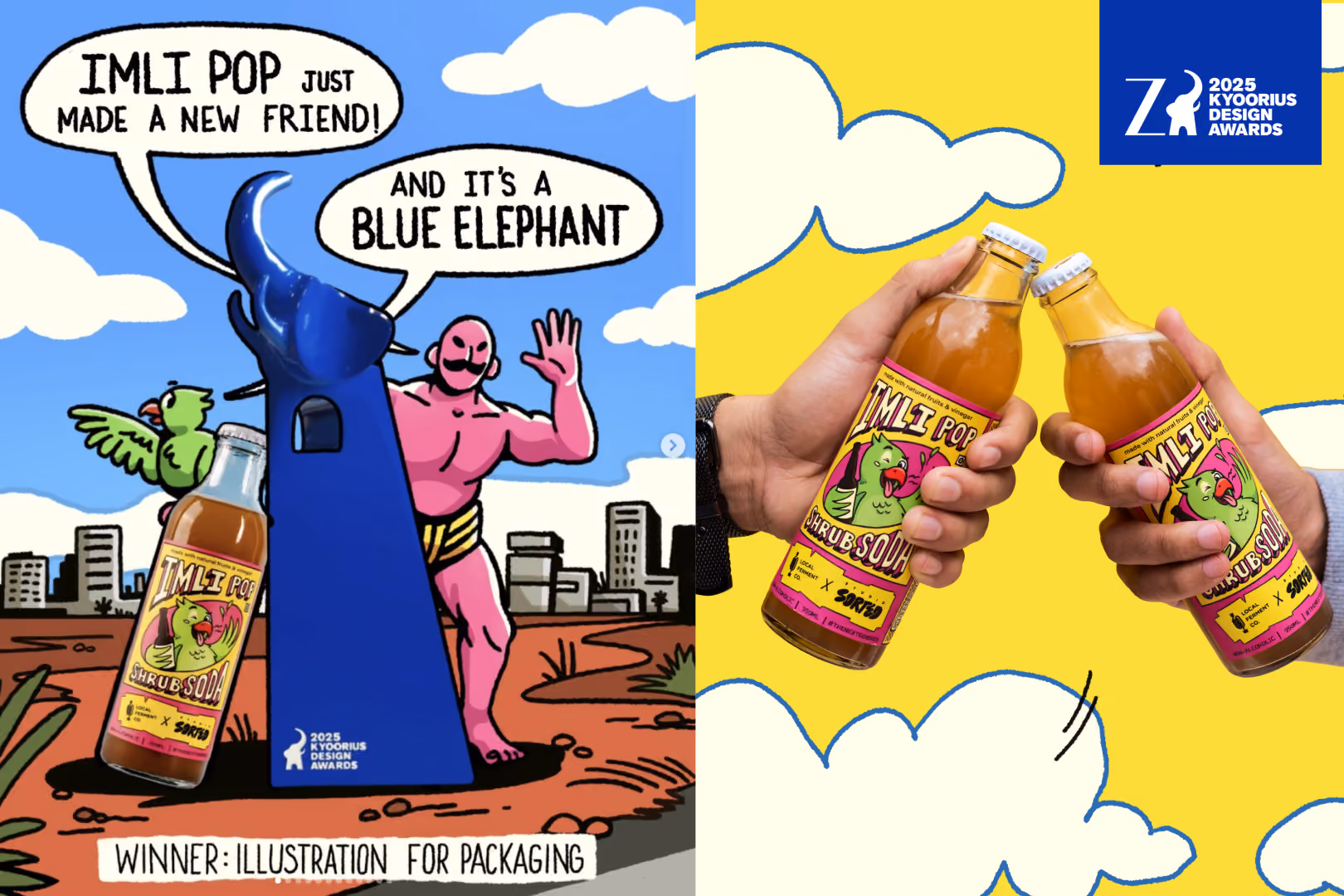
For Imli Pop, we built the entire brand experience for Indian 90s kids. The tone, the colours, even the launch—all designed to hit that nostalgia circuit hard. The result? Even people outside the core audience felt the pull.
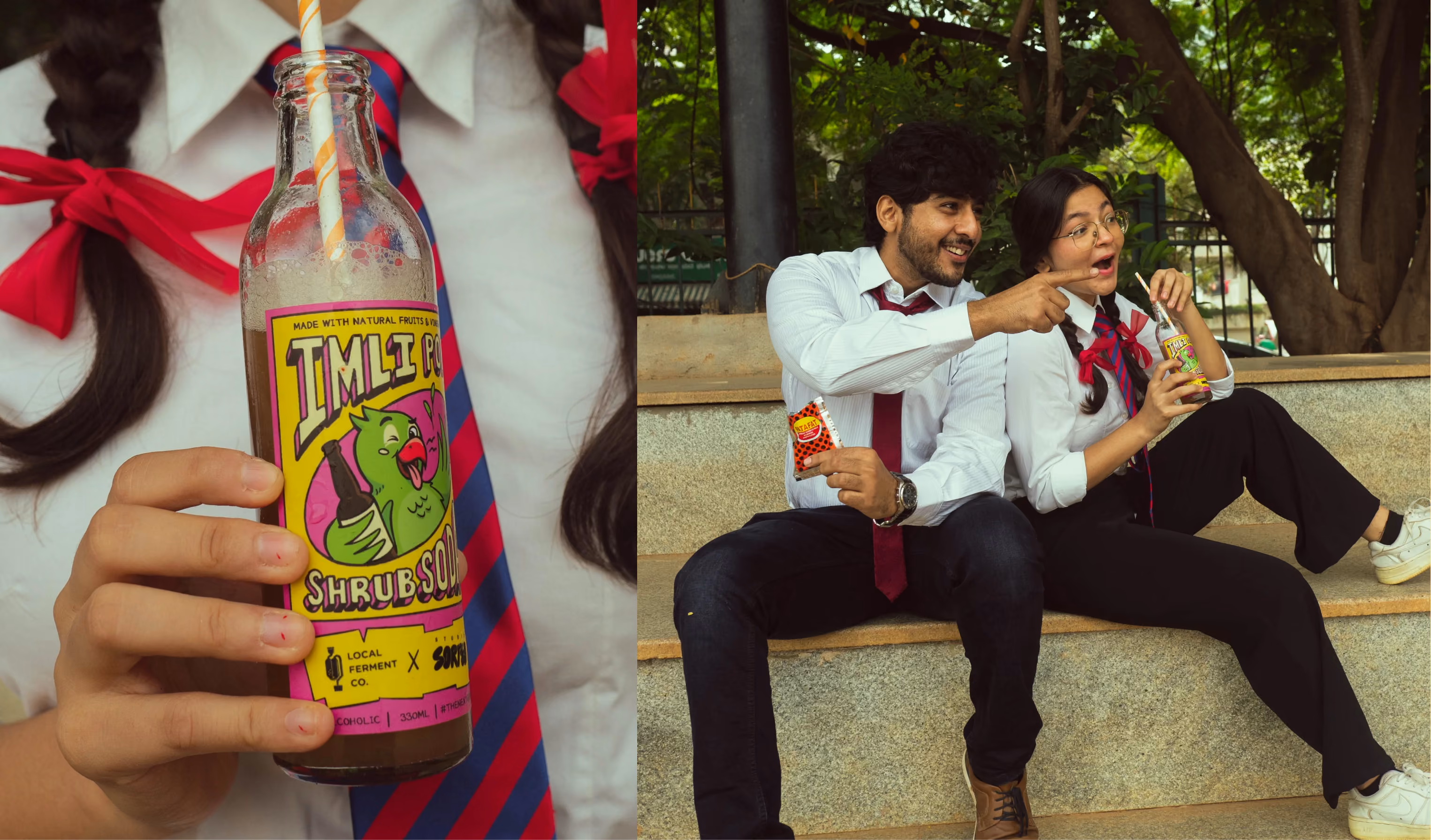
Go all out in pleasing your primary audience and then others will follow.
Packaging isn’t a flat surface—it’s a 3D experience. It lives on shelves, in bags, on messy kitchen counters.
Originality is great, but it means little if the function fails. The job of packaging is to serve the product first, and context second.
FAE Beauty is a great example of learning this the hard way. Their original lip gloss packaging was unique but overly complex—it looked cool but wasn’t easy to use or stack. They switched to a more conventional format used across the category. The twist? Their bold design system and transparent tube still made it stand out. The lesson: usability first, distinctiveness second.

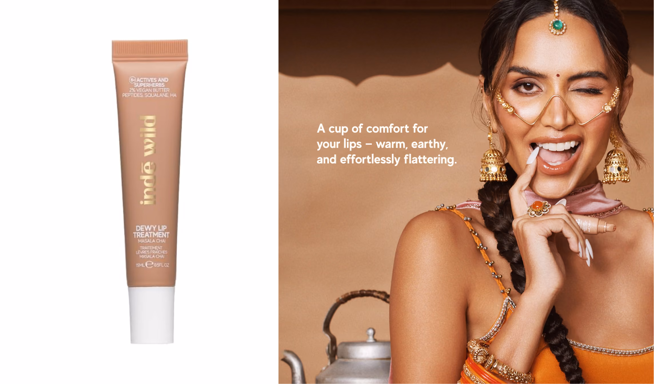
Then there’s Inde Wild. Their lip treatment comes in a minimal tube with clean labelling. Nothing groundbreaking. But the campaign around it—the story, the ritual, the visuals—makes it magnetic. The packaging plays support while the storytelling does the heavy lifting.
At Sorted, we often borrow proven formats from unrelated industries: wine labels for kombuchas, editorial grid systems for oat milk, and remix them for new use cases.
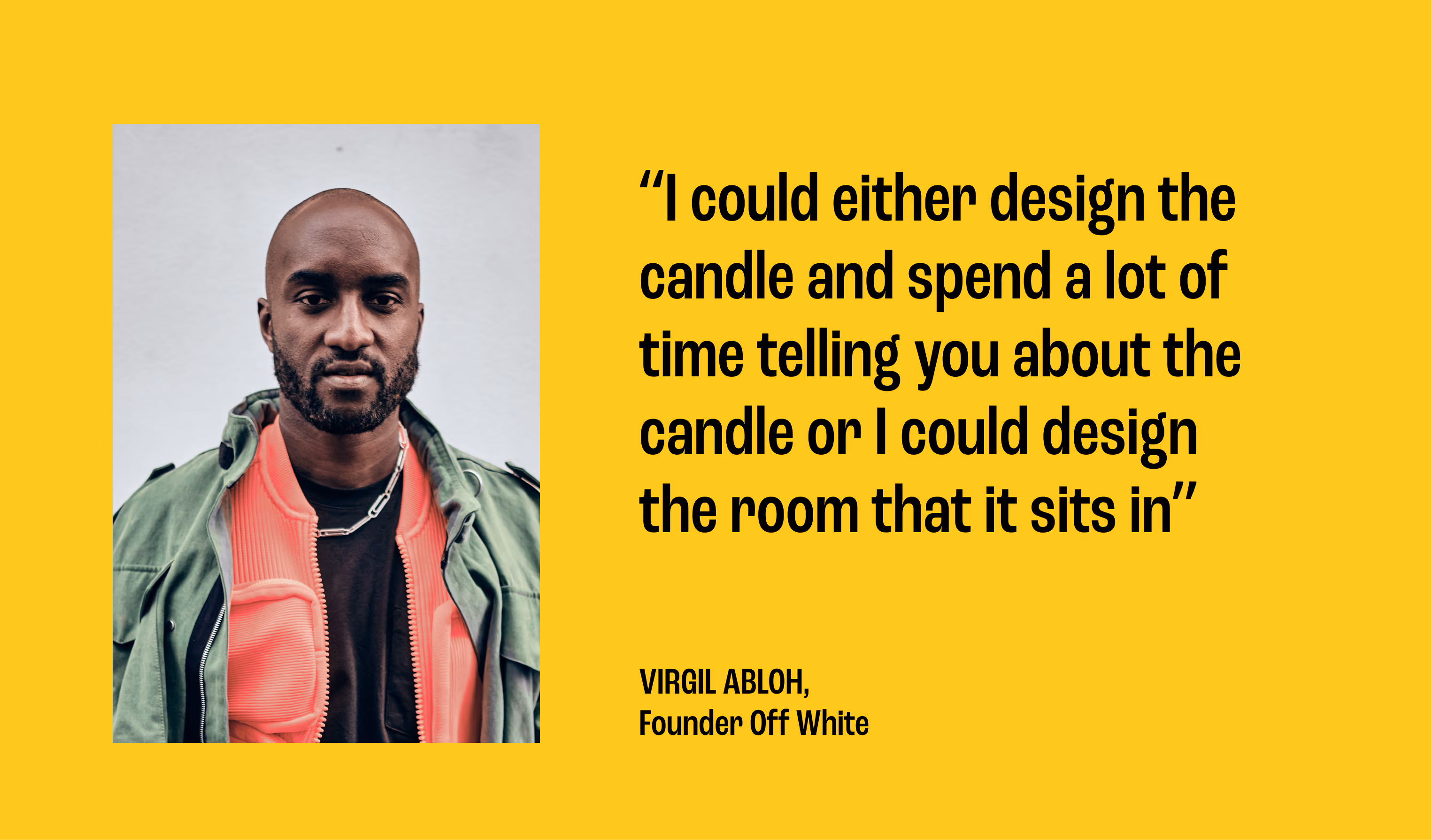
As Virgil Abloh once said,
Quick Summary:
Let’s talk eye movement.
Designing for this is less about decoration and more about psychology. Put key info where eyes naturally land, and use structure to slow them down just enough.
Good design feels intuitive—because it literally is.
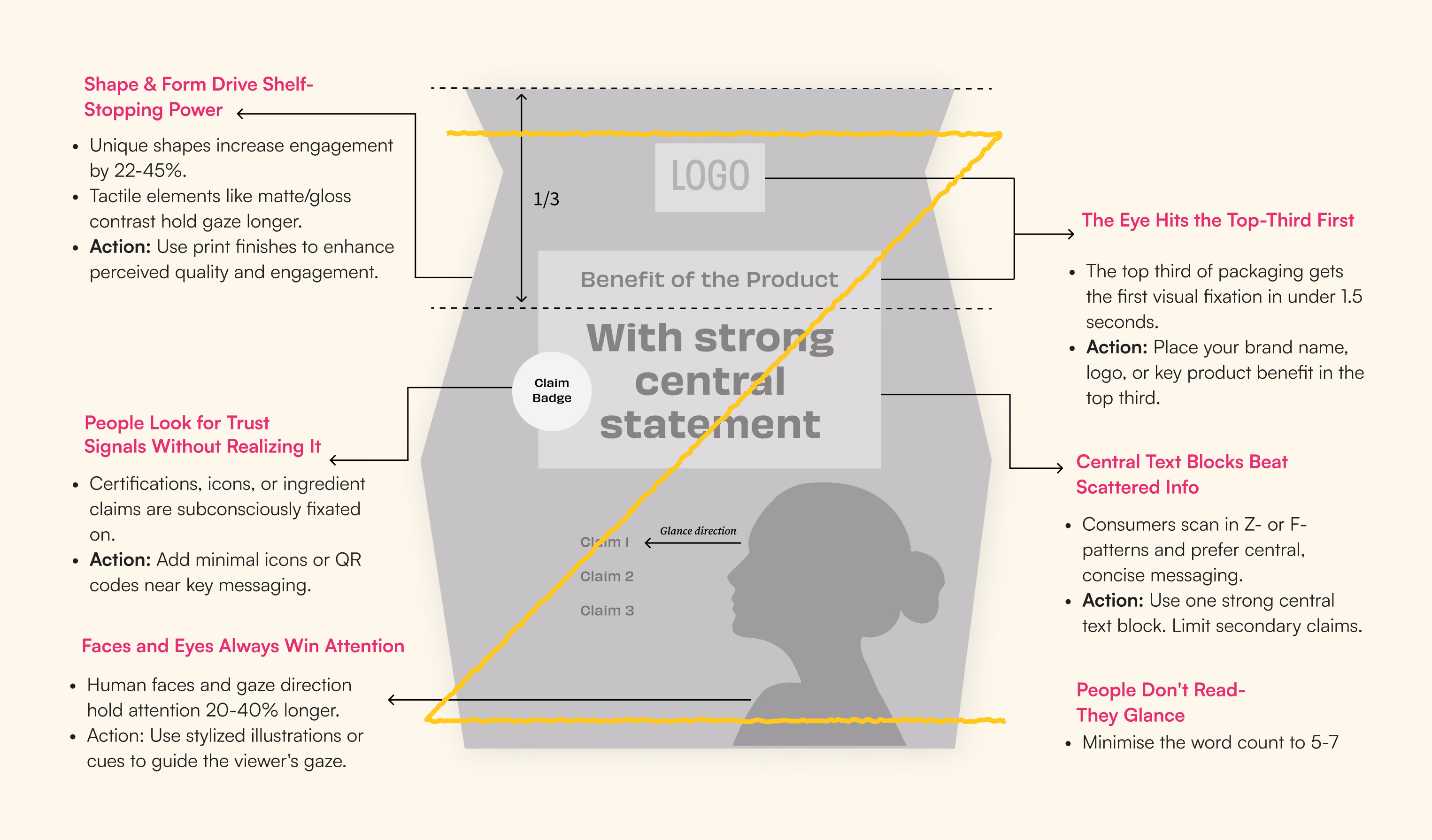
Quick Stats:
Packaging isn’t a design asset. It’s your product’s stage. It performs in stores, on shelves, in carts, on camera.
If your brand is ready to show up better—on shelves, in hand, in memory—we’d love to help make that happen.